Journey complete
You made it to the end!
Thanks for walking through my portfolio. Here’s your reward: my resume, and the quickest ways to reach me.
 Open my resume
Play again
Go to a chapter
Journey complete
Thanks for walking through my portfolio. Here’s your reward: my resume, and the quickest ways to reach me.
Open my resume
Play again
AI Product · B2B SaaS
Making event impact provable with AI.
For Gevme × #MEET4IMPACT
An AI platform that helps event and destination teams prove the change their events create, not just the headcount.
Launched · IMEX America 2026
Introduced to event and destination leaders from around the world at IMEX America.
 Built by
Gevme brings the technology and product. #MEET4IMPACT brings the impact method.
 First innovation partner
Montréal is the first destination to use it.
 Launch stage
Launched to the industry at IMEX America, Las Vegas.
Headcount says what happened, not what lasted.
Surveys, interviews and data sit apart.
Funders want outcomes, not attendance.
No structure, so it is rebuilt each time.
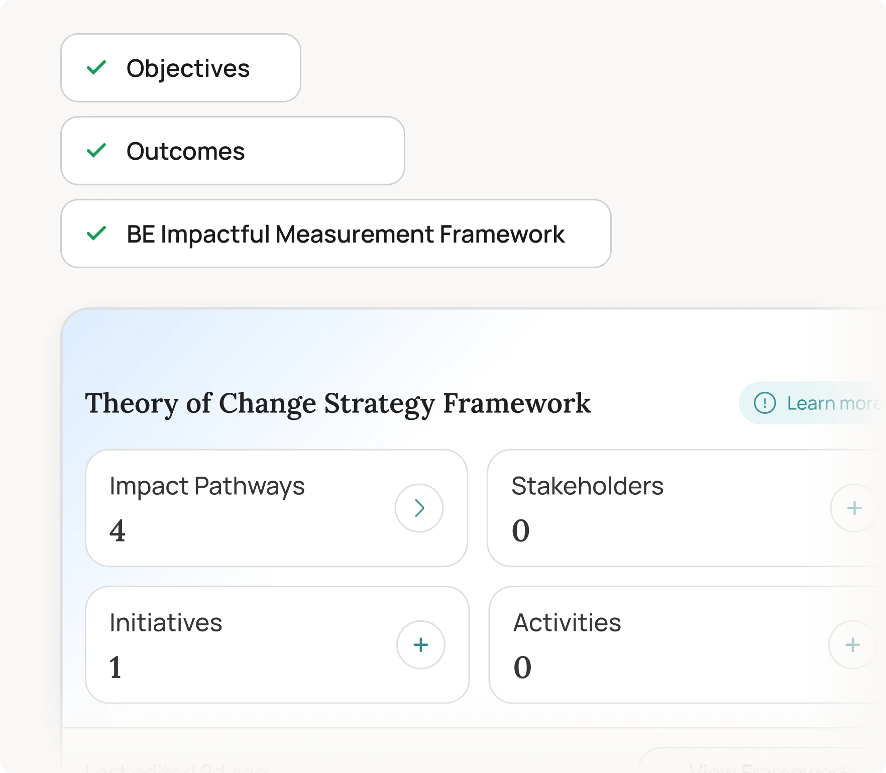
Goals, outcomes and who they matter to.
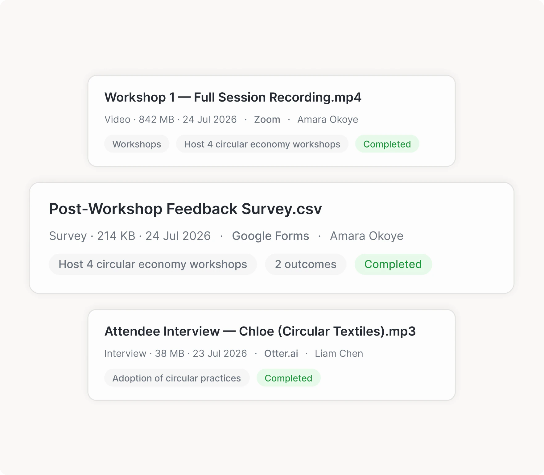
AI reads it and links it to each outcome.
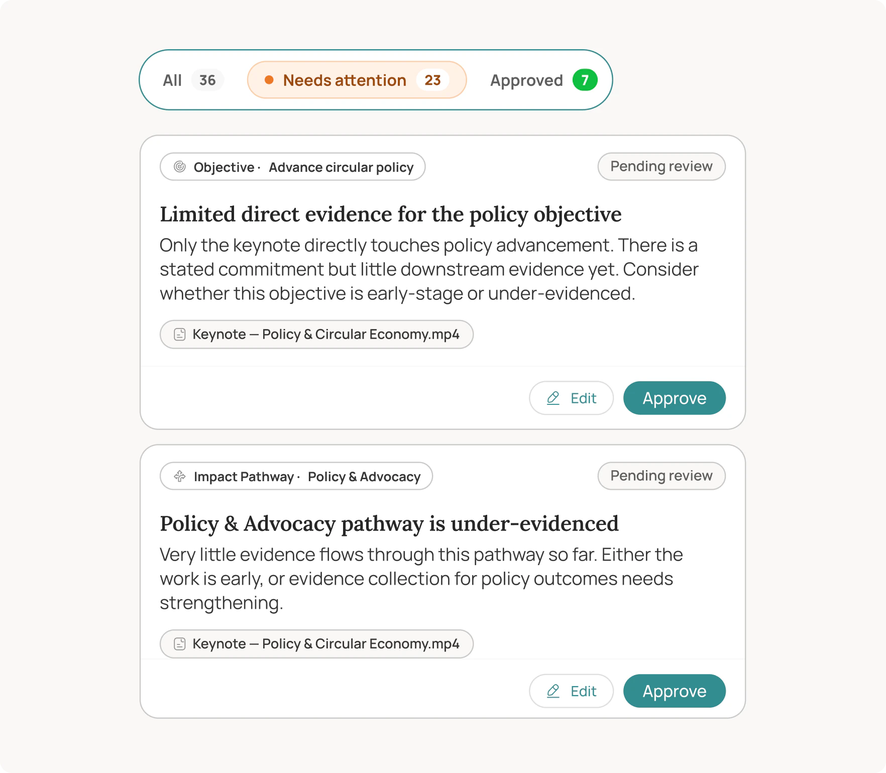
Reports for every audience, ready to act on.
Product images from impactaiq.com
I’m the product designer for the whole platform, now designing phase three.
The deeper work stays private for now. Let’s talk and I’ll walk you through it.
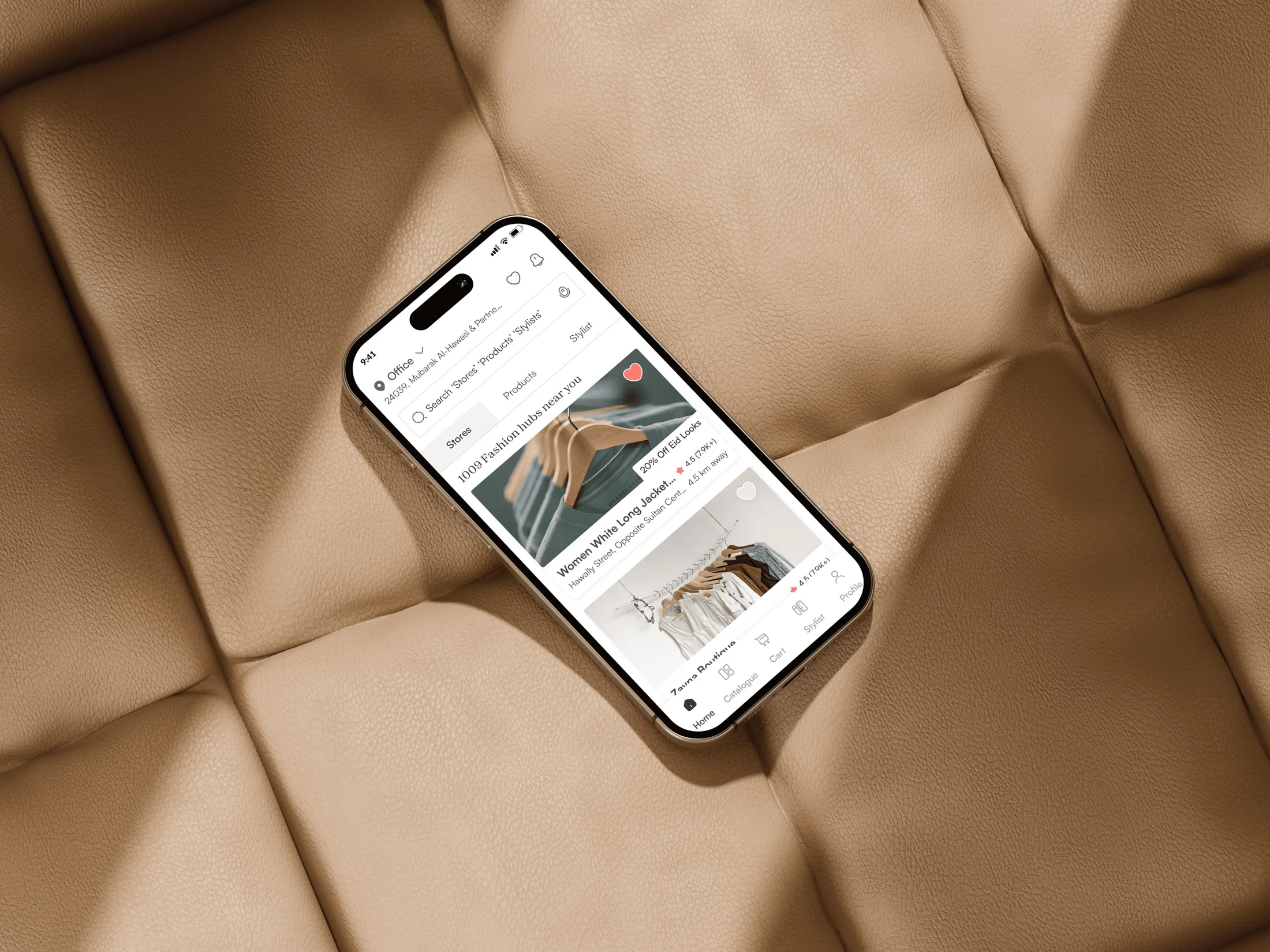
Product Design
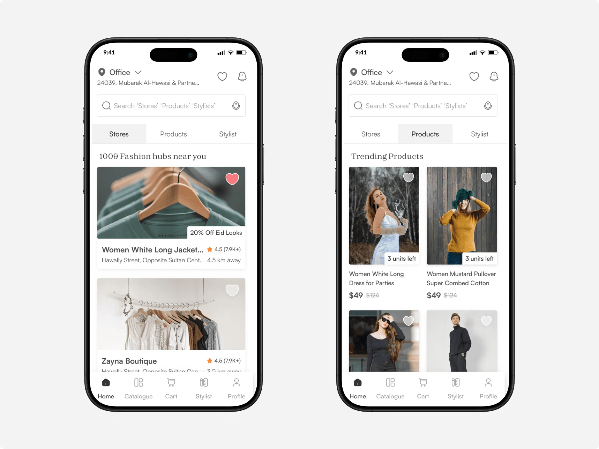
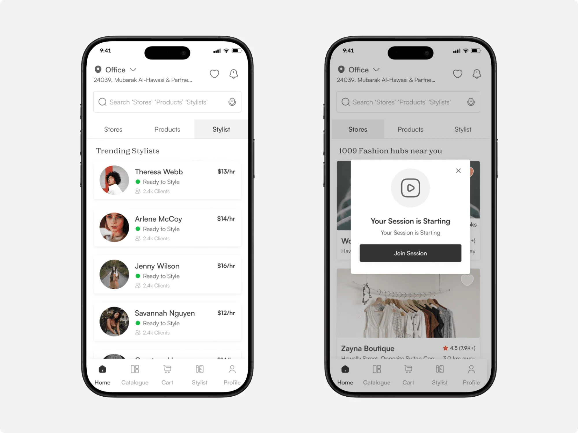
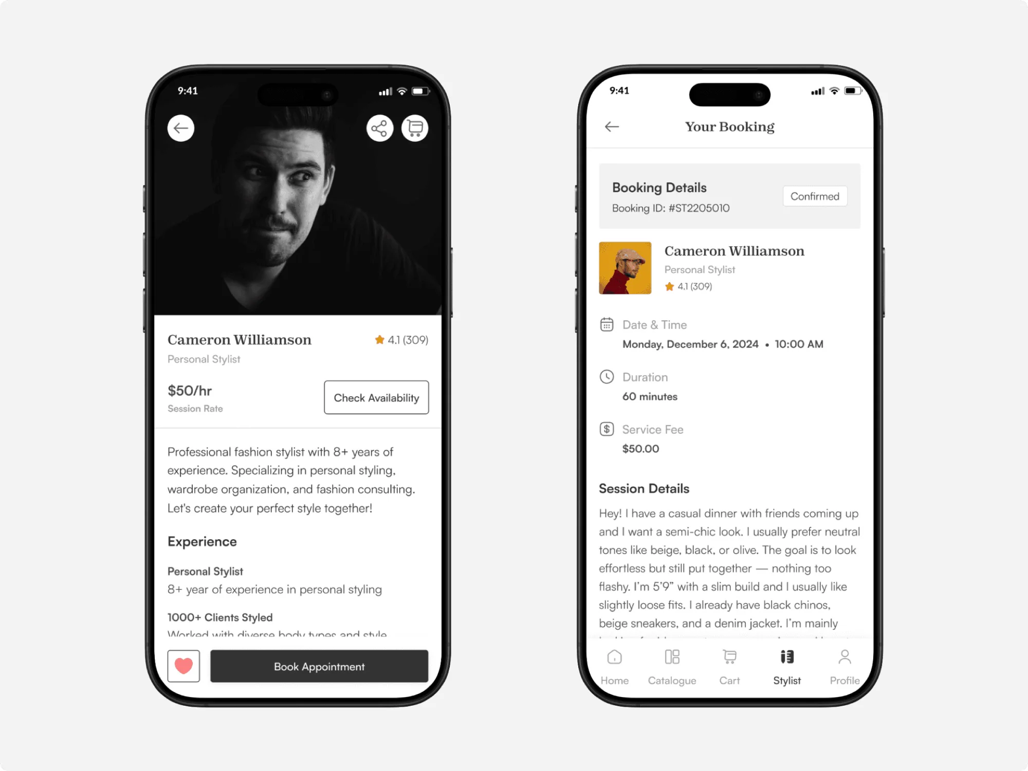
An on-demand fashion app connecting buyers, nearby boutiques and live stylists, with instant delivery.
For Roudan Al Roudan
Food and groceries can be delivered instantly, but fashion hasn’t caught up. Fash set out to simplify and speed up buying outfits on-demand, especially when people need them urgently for a specific occasion.
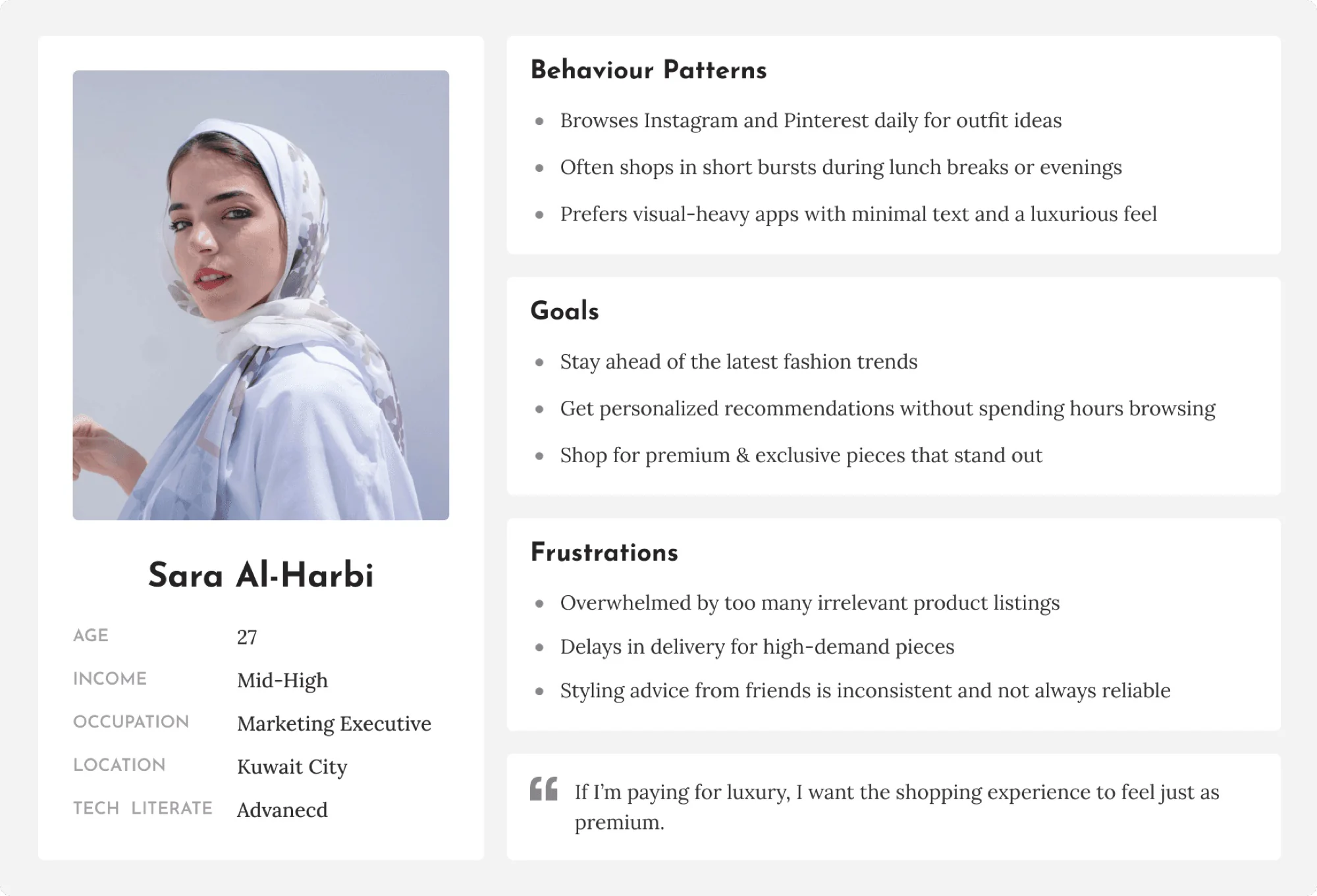
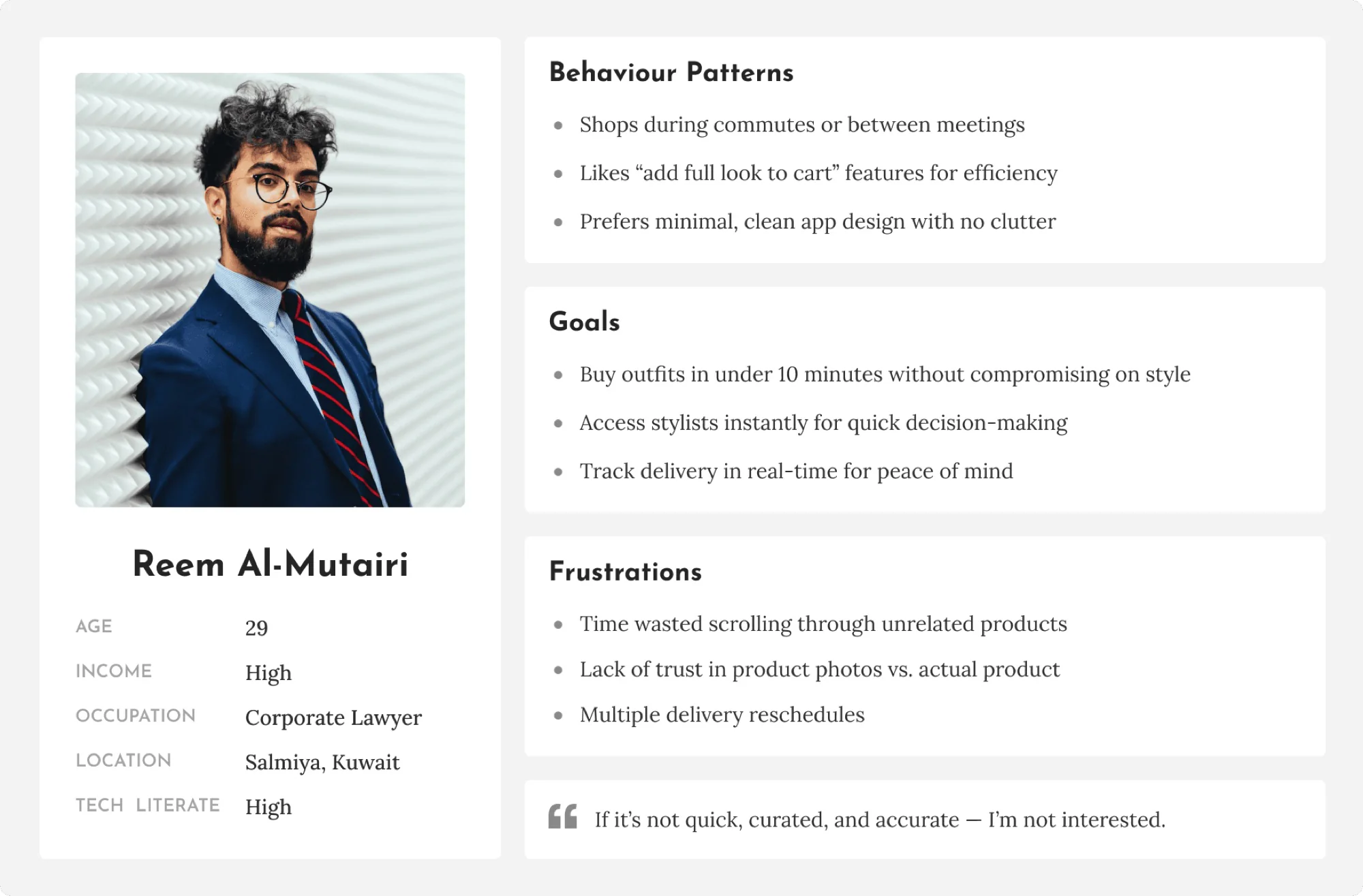
I dove deep into real shopping behaviours to design a concept that fits naturally into users’ lifestyles, saves time, and supports both buyers and sellers seamlessly.
01 / 05
Simplify and speed up buying fashion on-demand.
Food and groceries arrive in minutes. Fashion hasn’t caught up, and the gap frustrates people.
Need a last-minute outfit, can’t find stores nearby, waste time checking stock.
Miss out on potential walk-in sales.
Study real shopping behaviour first, then design for buyers and sellers together.
02 / 05
The results first. Each one traces back to research.
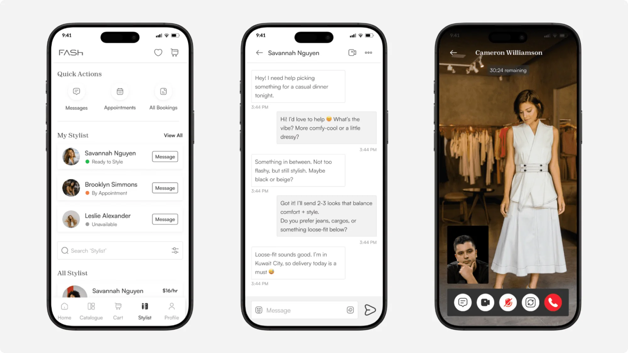
Live stylists inside the buyer journey cut hesitation and shorten decisions.
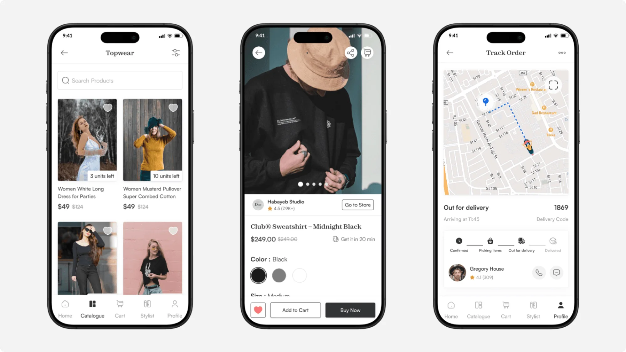
Only stock from nearby stores, delivered instantly, so people buy sooner.
03 / 05
20 in-depth interviews across four groups shaped the app’s direction.
Product Owner, CTO, Marketing Lead, Ops Head, Stylist Partnership Manager
Targeted in Kuwait, aged 22–40
Boutique owners and store managers
Independent and store-affiliated
“Instant style advice.”
Design: Stylists recommend from store stock, right in the chat.
“Know the buyer first.”
Design: Preferences, past purchases and size, up front.
“Trust before buying.”
Design: A clear 2-hour return, easy to find in the app.
“Fewer steps to pay.”
Design: Fewer fields, saved details, buy straight from a recommendation.
“Premium, not food delivery.”
Design: Look and flow of luxury apps like Farfetch and Net-a-Porter.
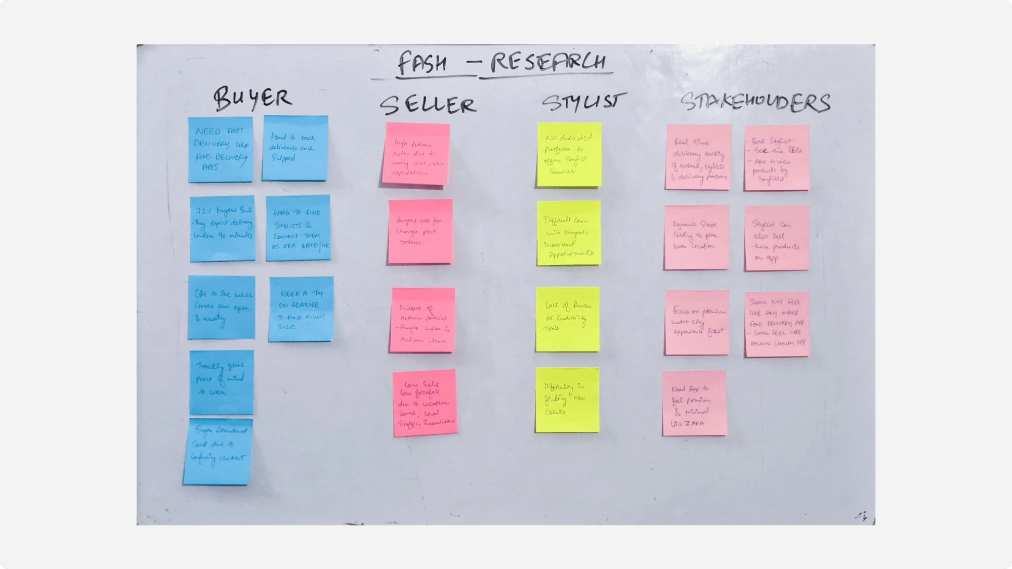
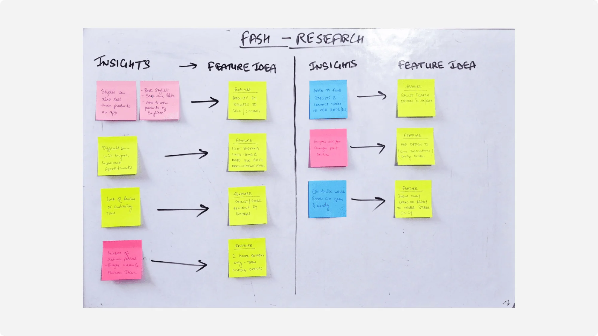
From sticky notes to features, every idea backed by real feedback.
Main interview points on sticky notes, one colour per group.
Removed repeats and anything design can’t solve.
Grouped what was left into themes.
Wrote feature ideas next to each theme.
04 / 05
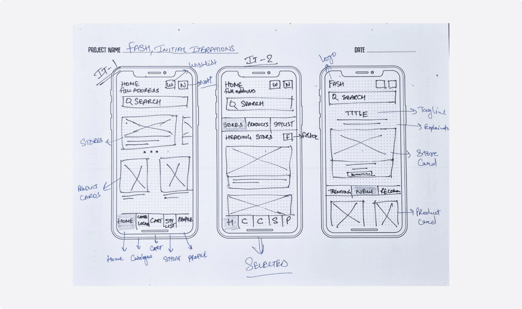
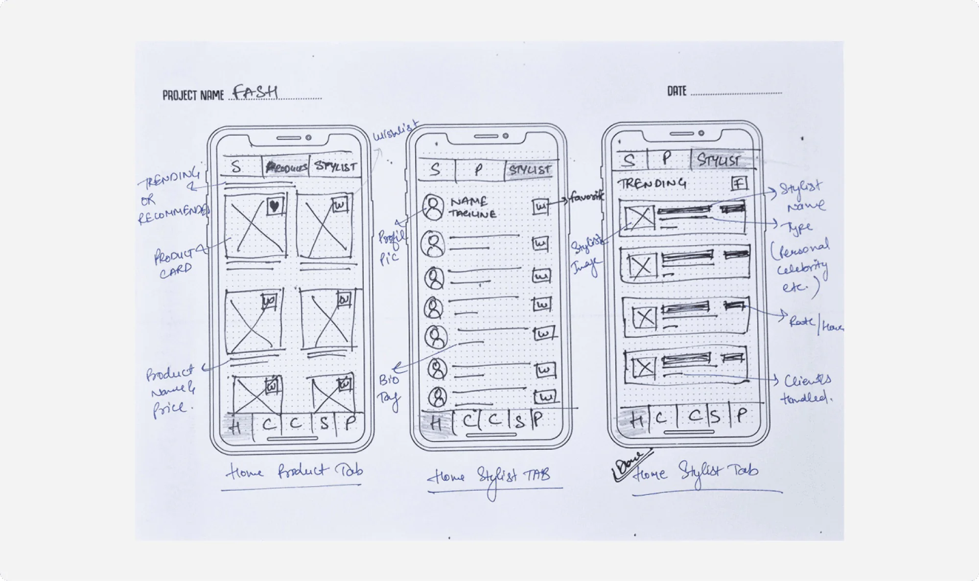
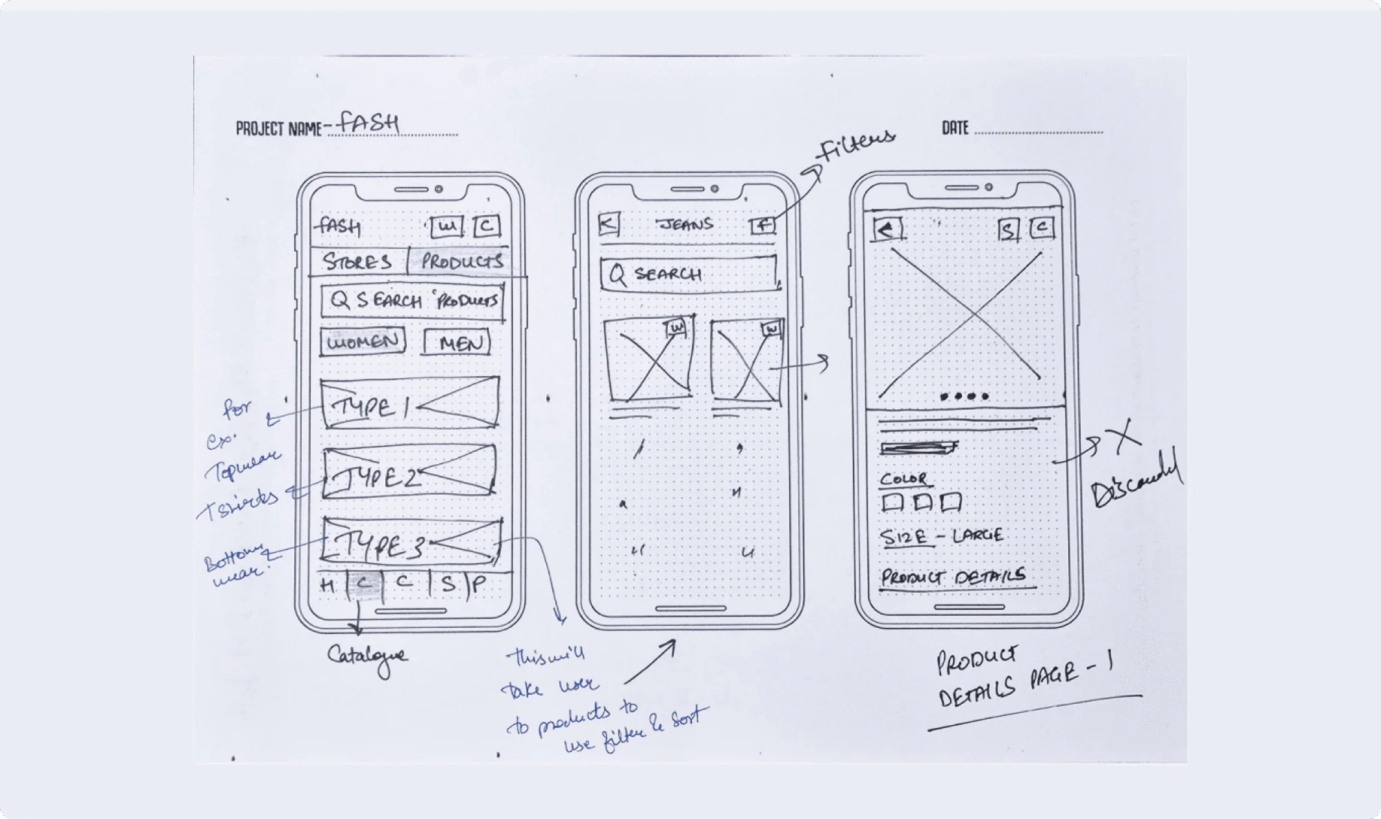
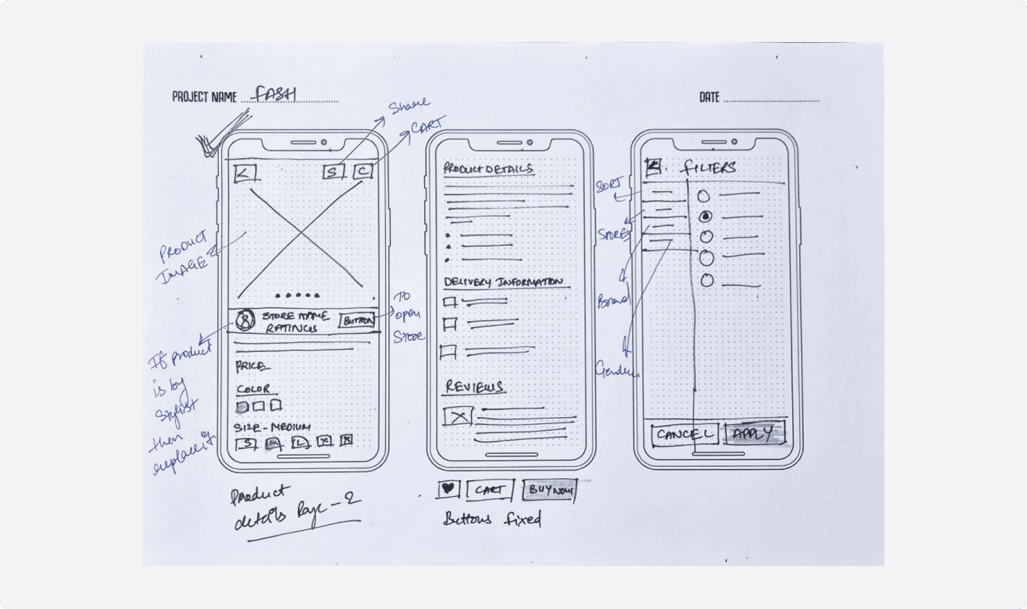
05 / 05
Web Platform
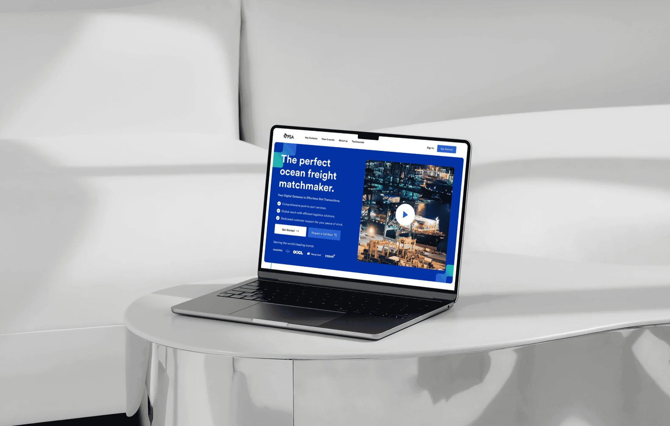
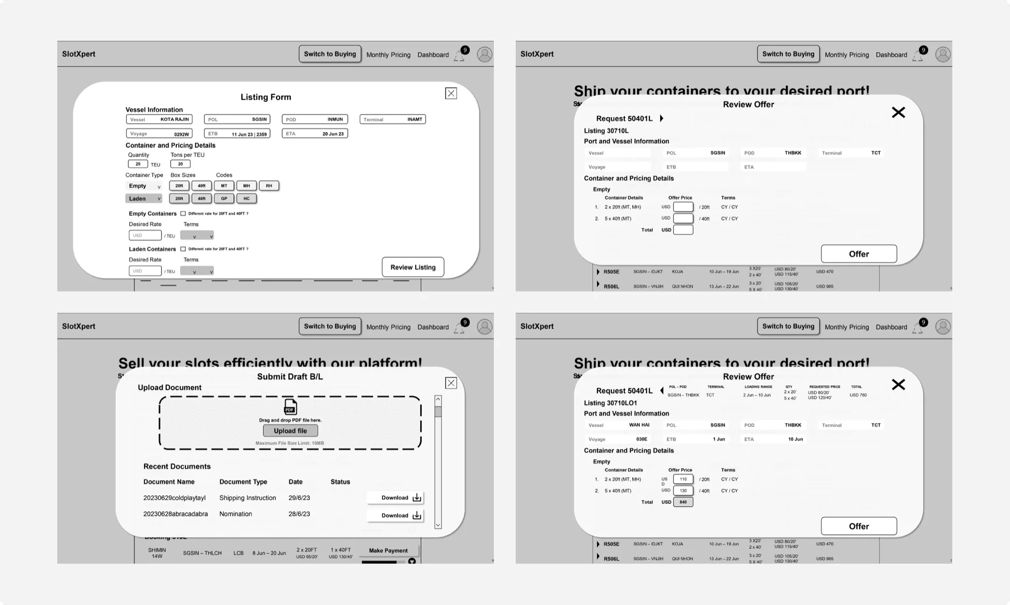
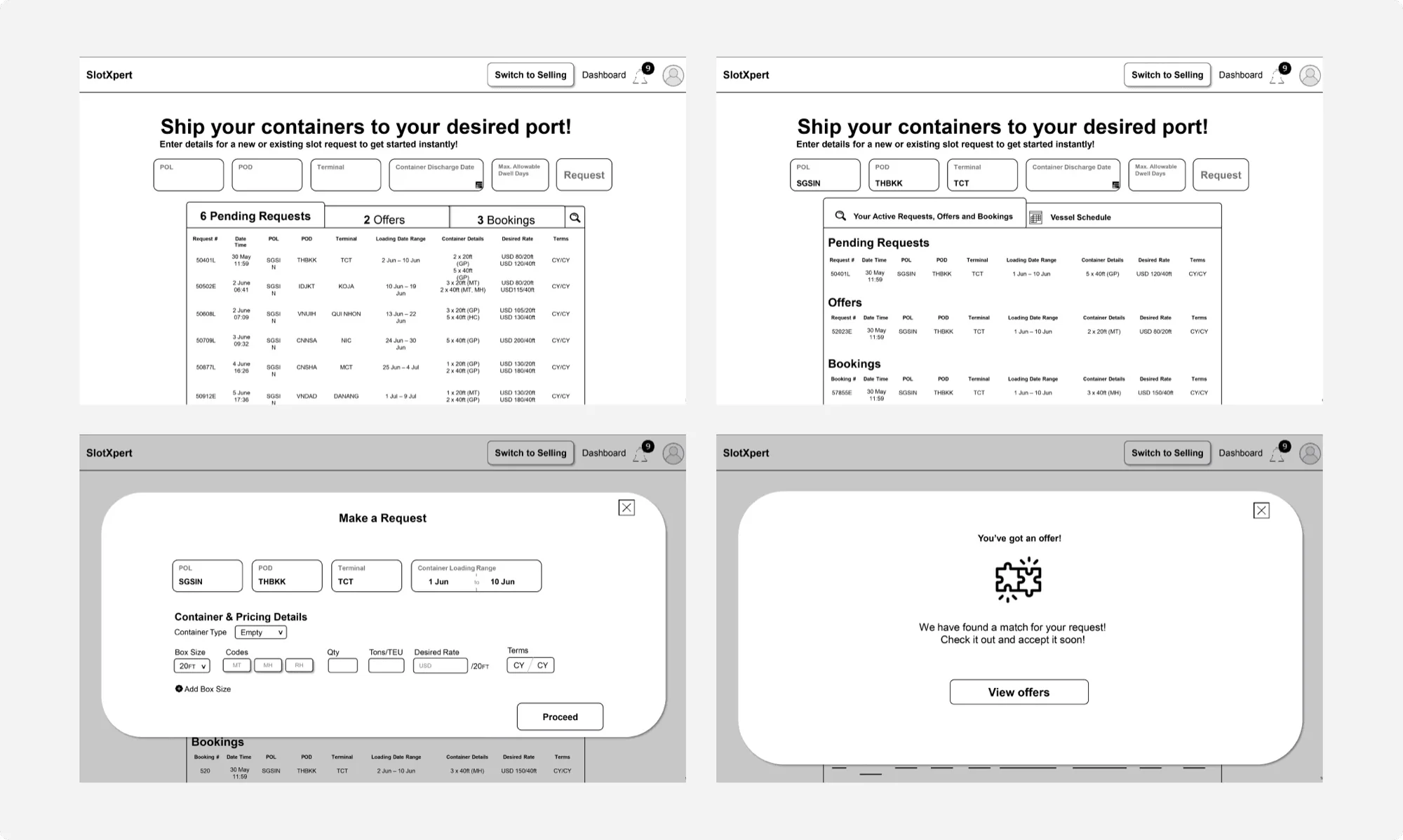
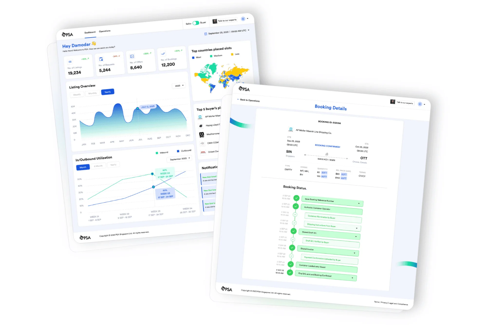
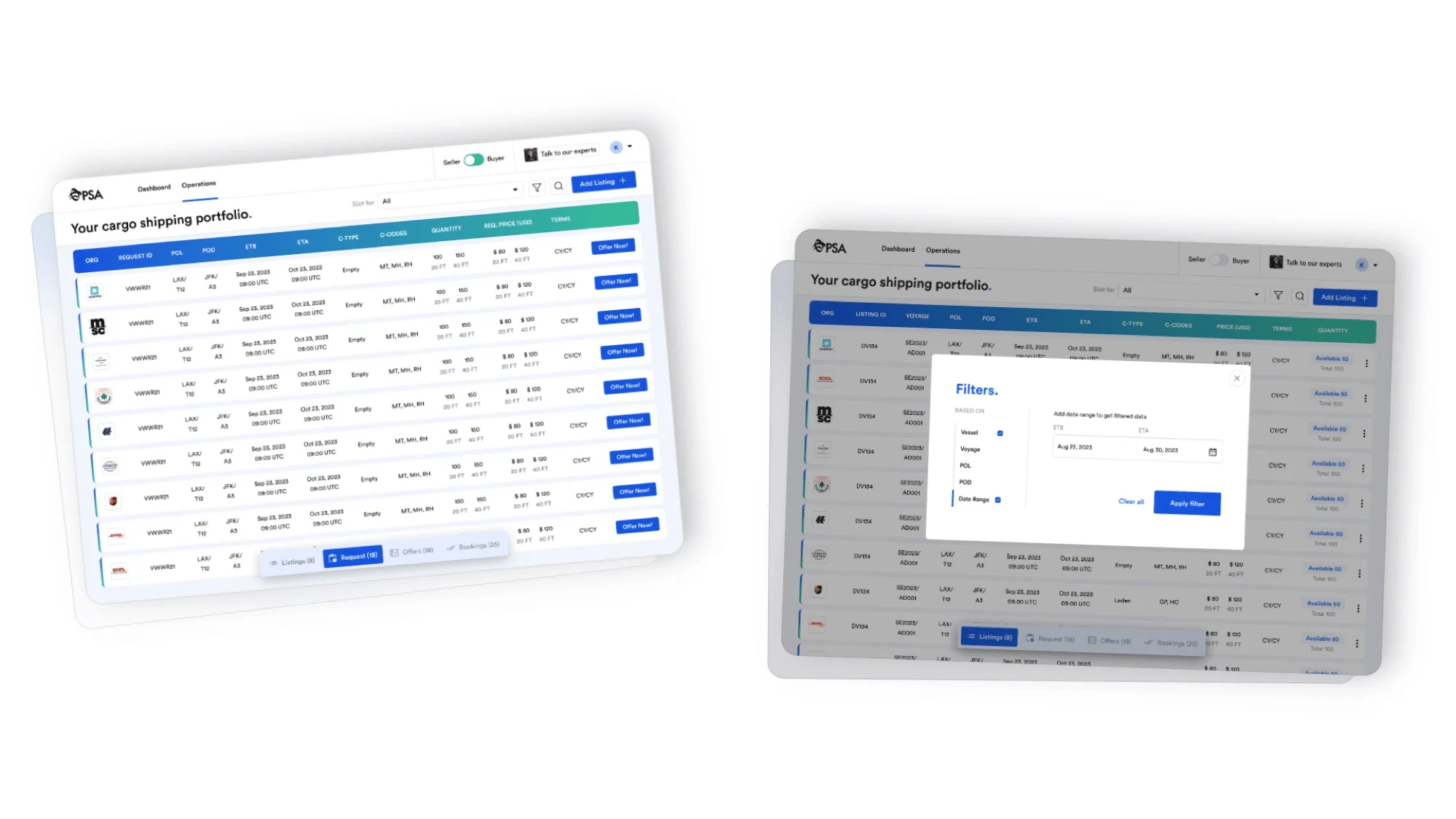
Migrating a decade-old desktop app into one unified web platform for container buyers and sellers.
For The Port of Singapore Authority
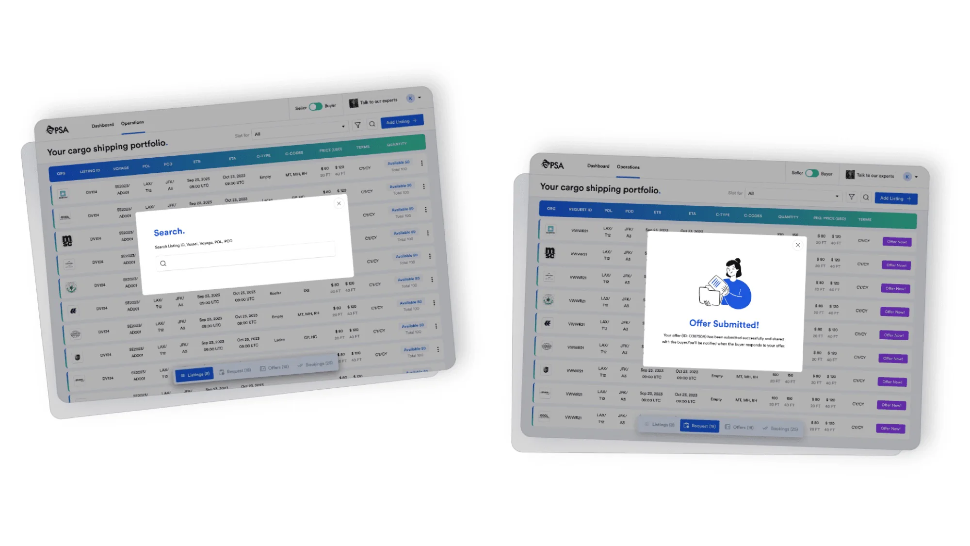
SlotXpert aimed to replace its decade-old desktop application with a unified web-based platform for buyers and sellers.
The biggest challenge was making the transition easy for users who were deeply accustomed to Excel-like workflows.
01 / 05
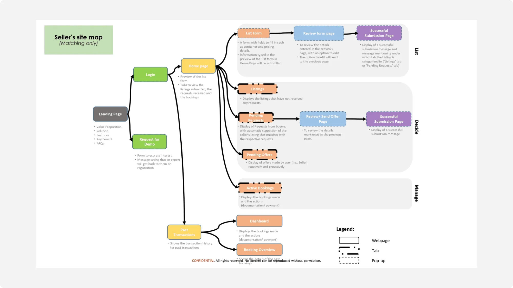
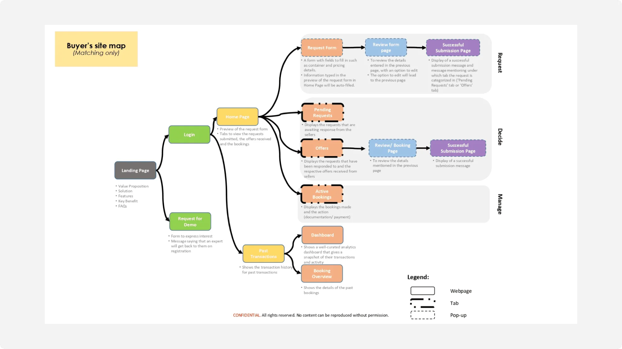
One web platform for buyers and sellers, without losing anyone on the way.
A decade-old desktop app.
One unified web platform.
Users were deeply used to Excel-like workflows.
02 / 05
One platform for buyers and sellers, and what followed.
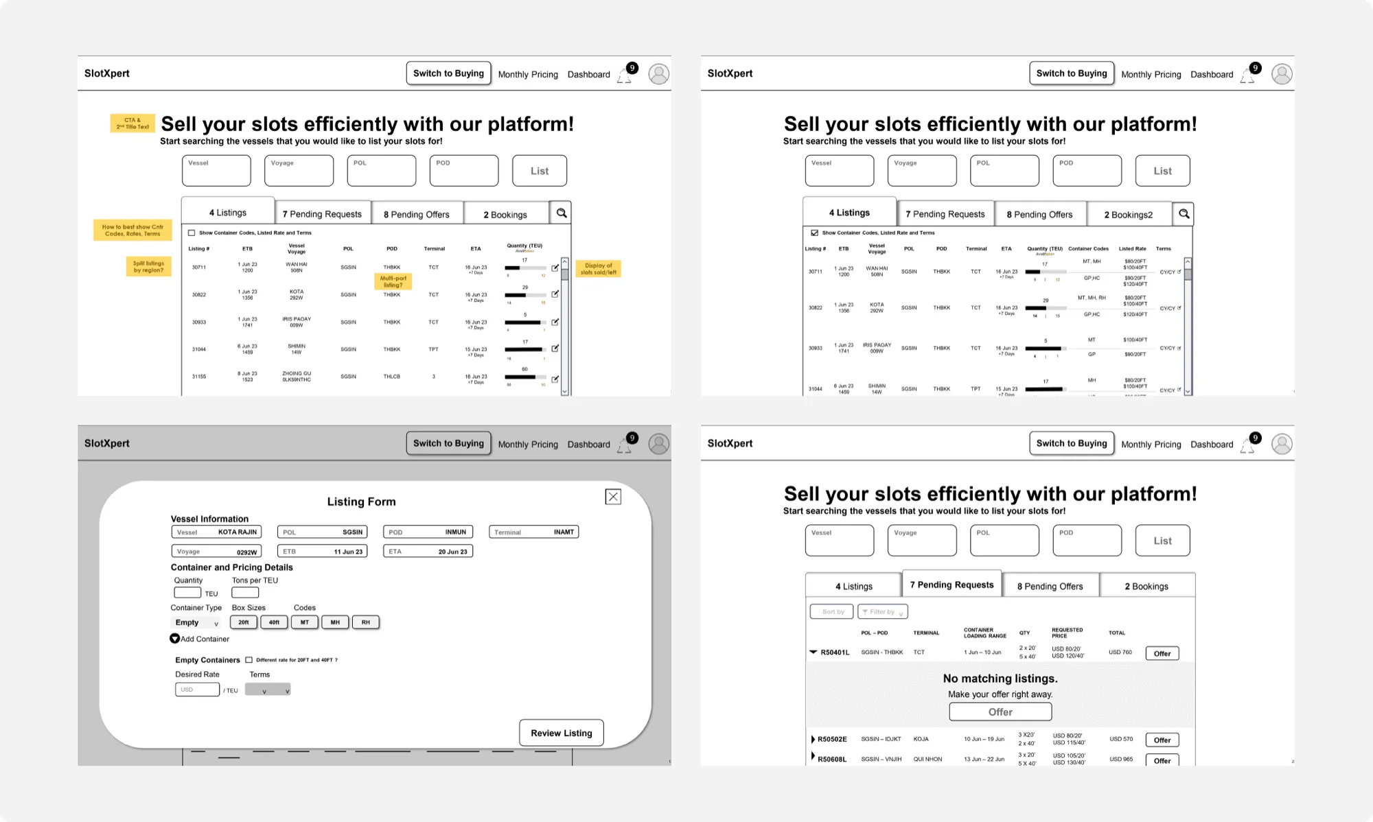
Clearer tables, filters and actions made data easier to read and act on.
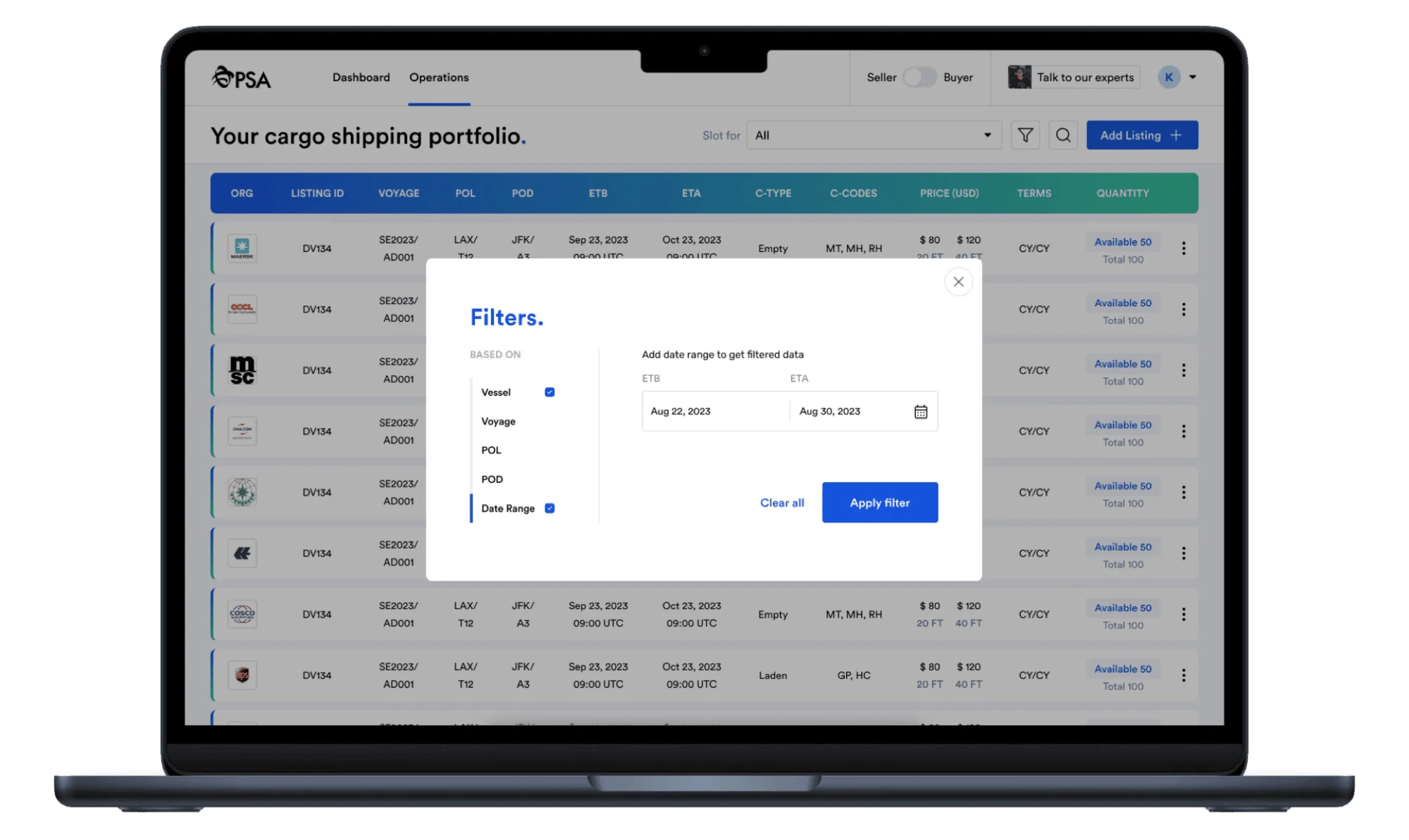
One dashboard for buyers and sellers. No more juggling platforms.
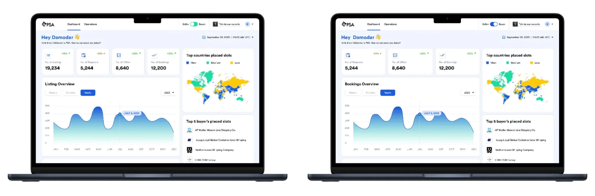
The Excel-like structure stayed, so the new platform felt familiar from day one.
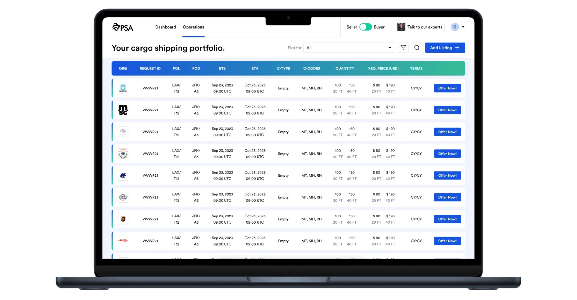
03 / 05
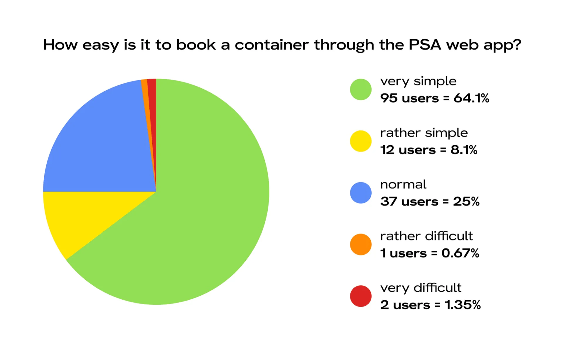
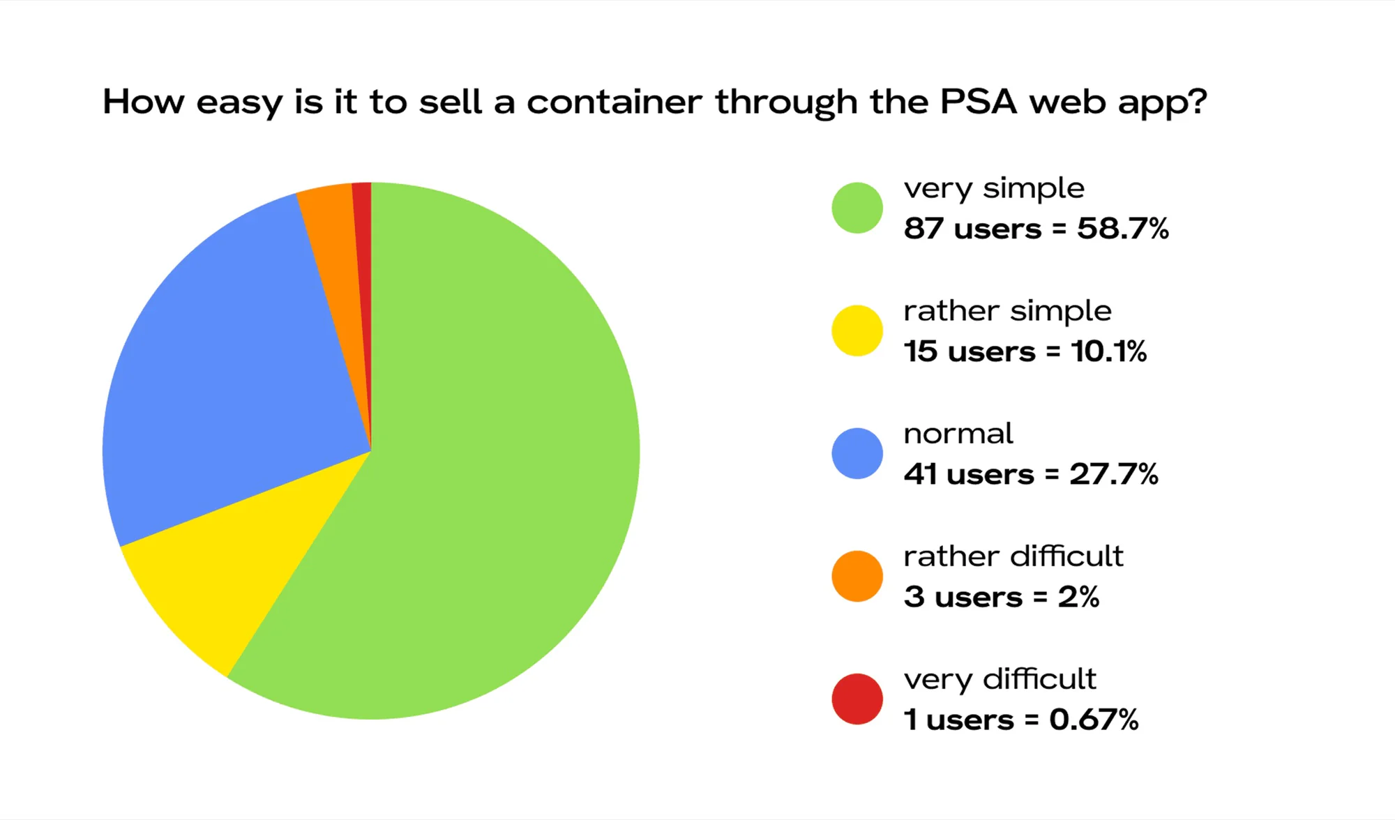
Separate surveys for buyers and sellers set the baseline to measure UX gains.
What came up
Functional, not optimised. Bookings needed more clarity and speed.
What came up
Simpler listing actions, less clutter, clearer inventory and offer states.
How
What I asked
Moving users from the long-used desktop app to the web platform without creating friction or user loss.
Buyers and sellers were on separate platforms; the new system needed to merge them seamlessly.
Any frustration during the transition could cause attrition, so it was vital to keep the learning curve low.
04 / 05
05 / 05
UX Redesign
Fixing the usability of a swipe-based job app without changing the identity users already knew.
For Metafic
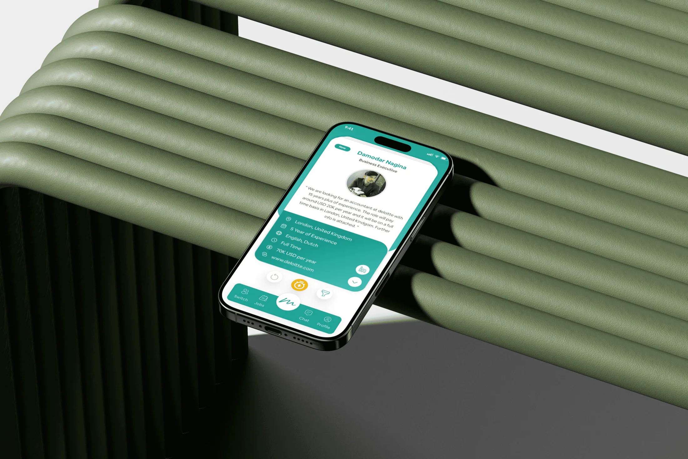
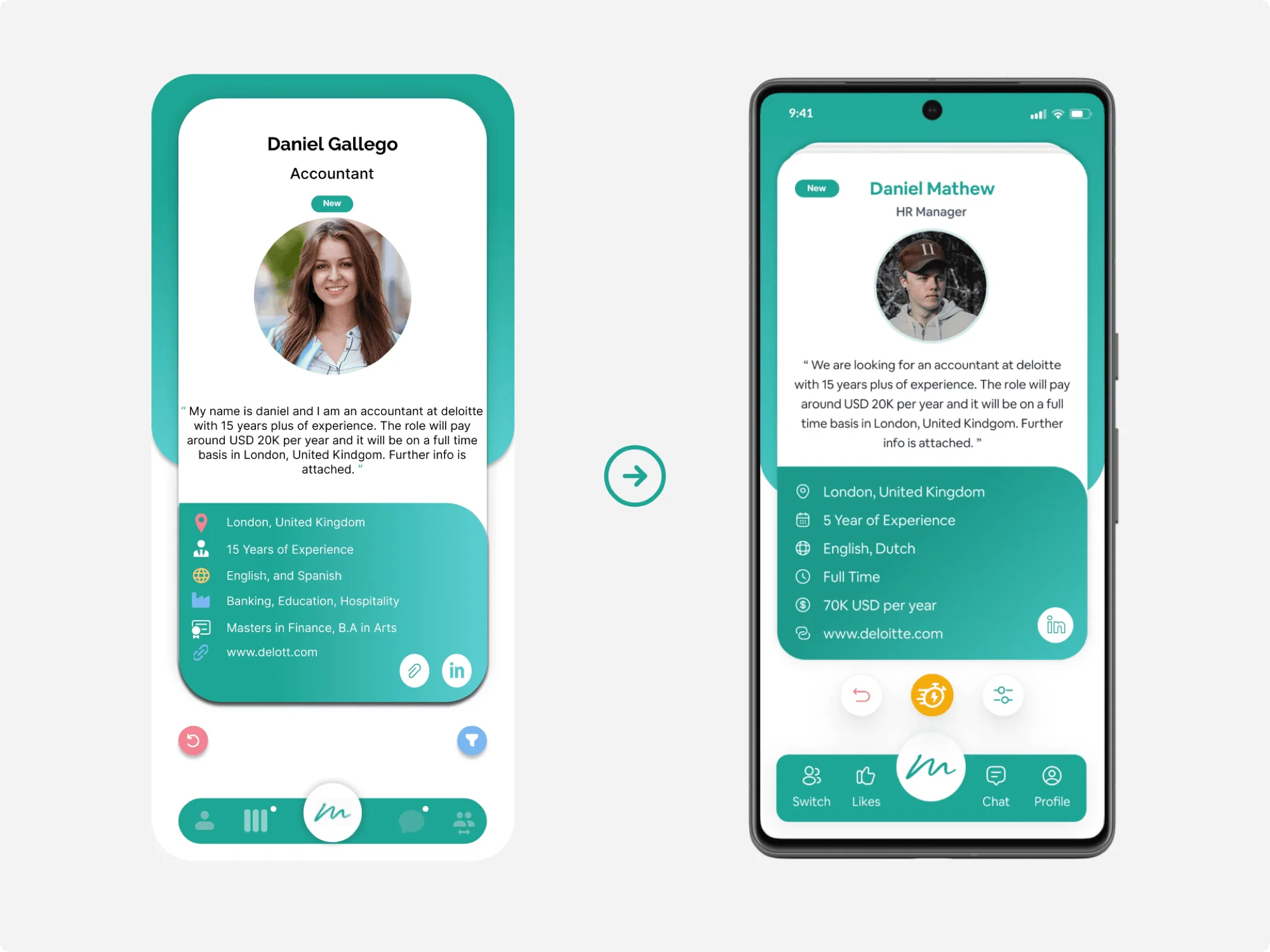
McPloy is a swipe-based job and recruitment app with a twist: it works like Tinder, but for finding jobs and hiring people.
The client wanted a better user experience without losing the original “McPloy” look and vibe they had already invested in.
01 / 04
A swipe-based job app for two kinds of users.
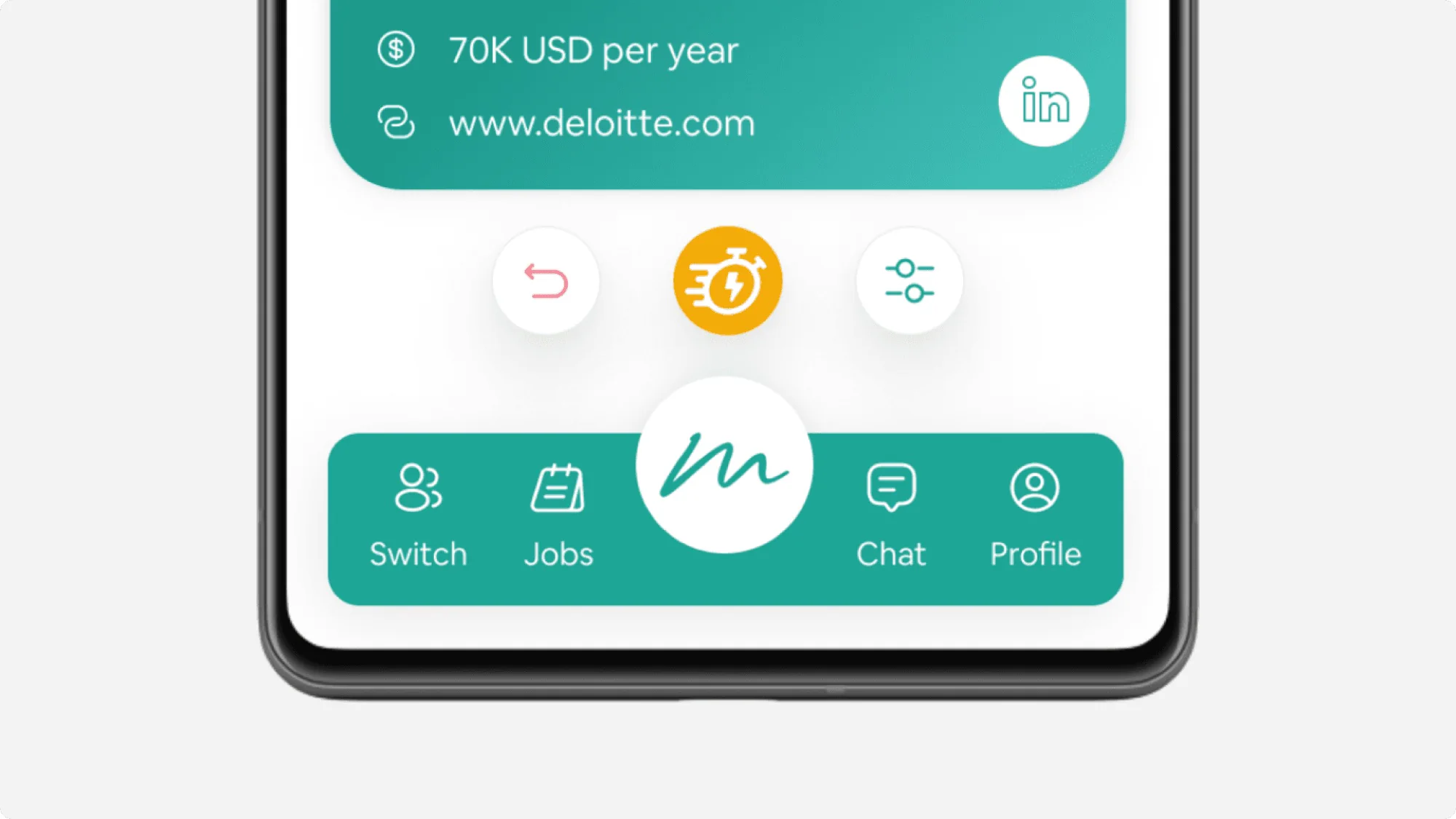
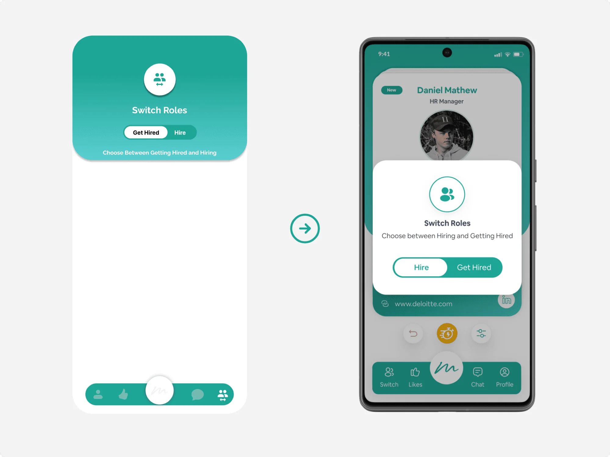
Job seeker or employer. A switch swaps roles anytime.
Seekers swipe on jobs, employers on candidates.
Both swipe right, then chat in the app.
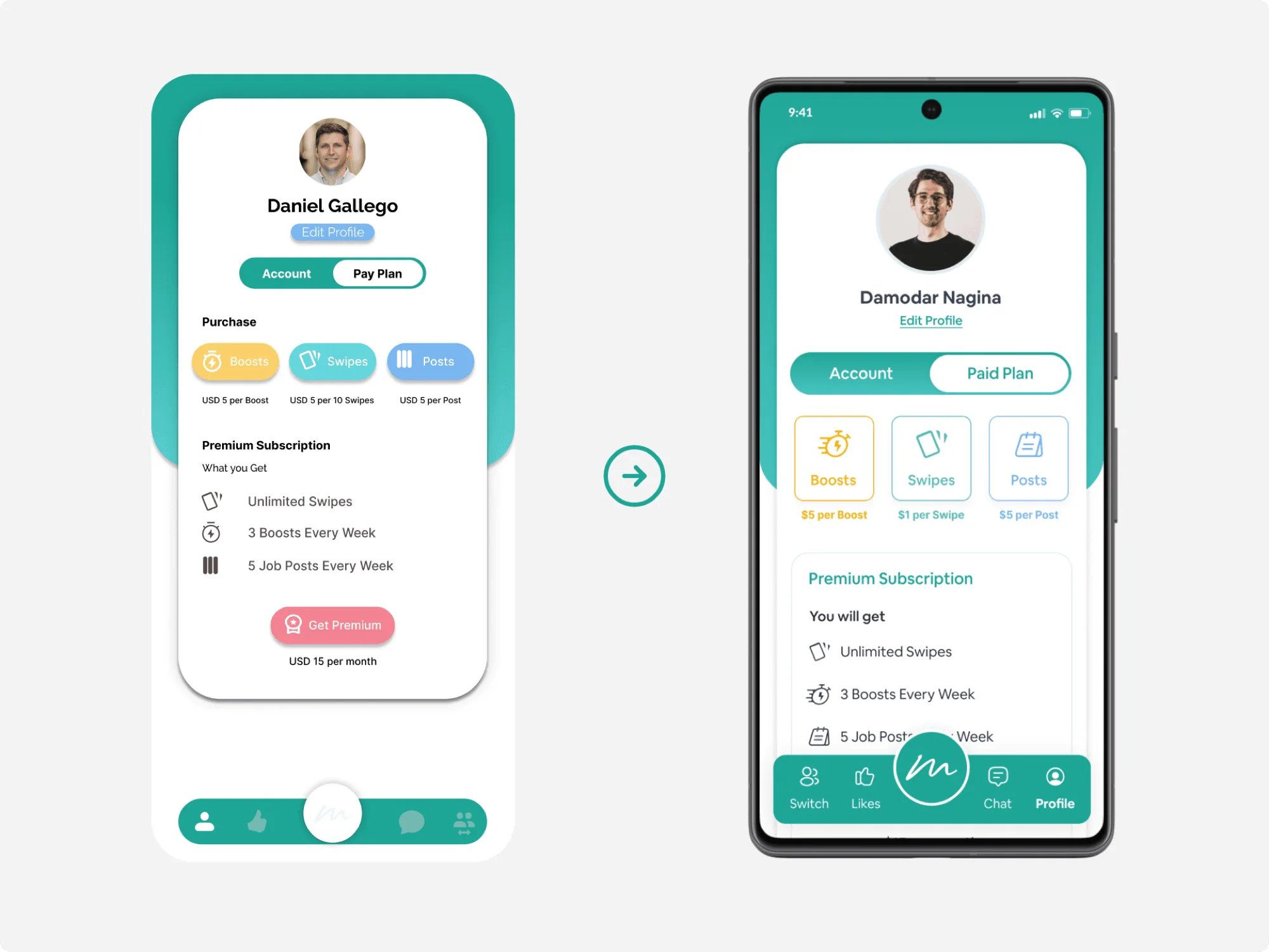
Buy extra swipes for more chances.
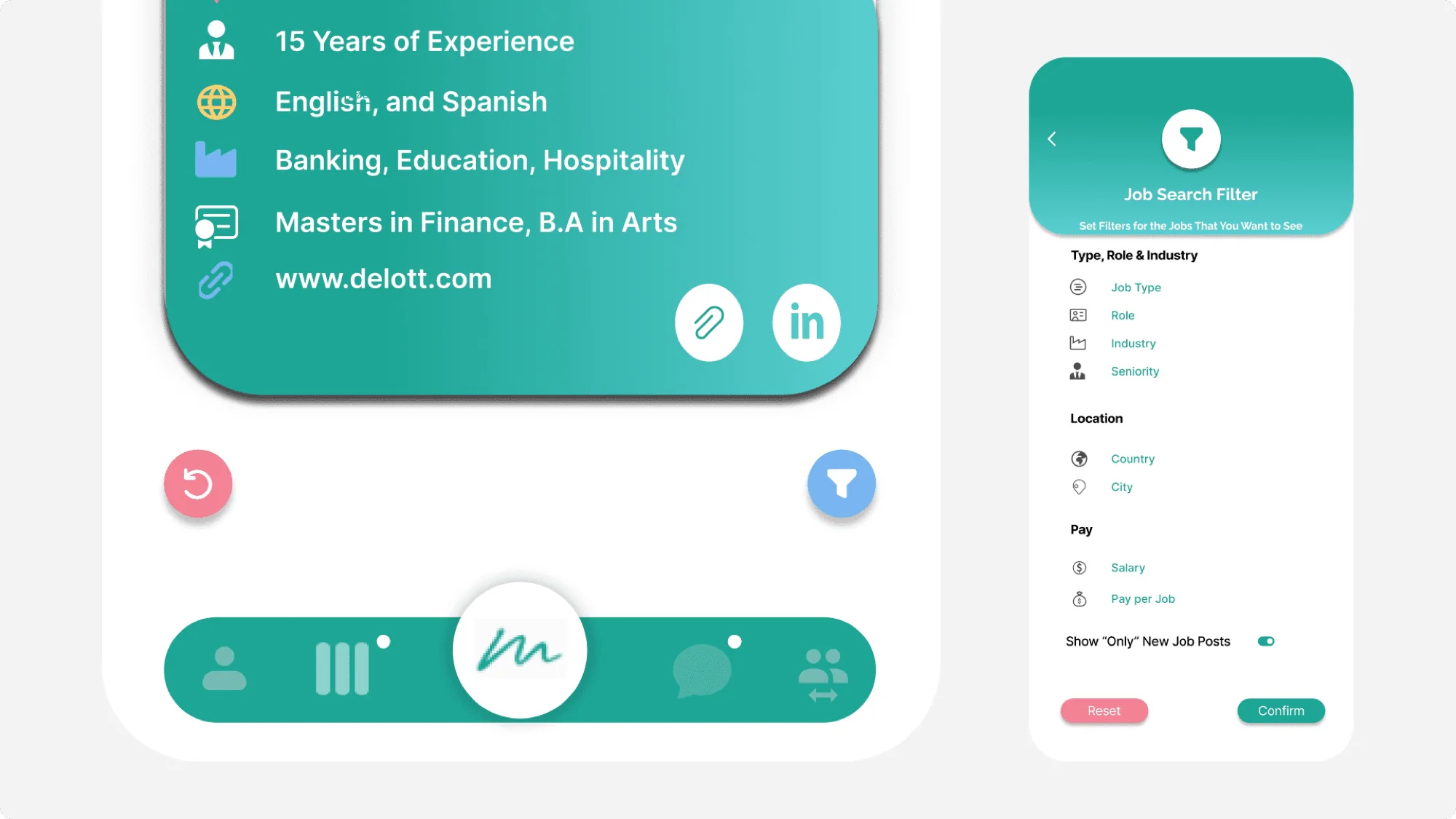
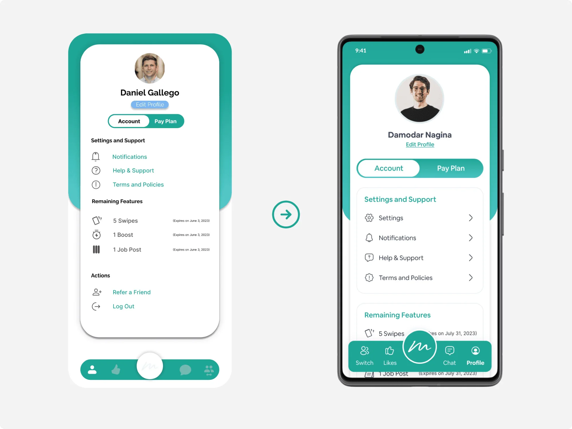
Fix the usability without touching the identity.
Keep
Fix
02 / 04
Small, crowded, inconsistent icons caused frequent misclicks.
The usability score (SUS) jumped after the redesign.
Boosts were hidden and never explained their value.
03 / 04
The design language had to stay, so I started with the people who run the product.
I asked
I learned
8 participants, 4 tasks each.
within 10 seconds
said the icons felt “confusing” or “too similar”
reported when switching between modes
4 job seekers, 4 employers
No feedback on swipe limits.
Inconsistent icon styles.
Role-switch lacked clear indicators.
Inconsistent spacing, colourful and stretched icons.
04 / 04
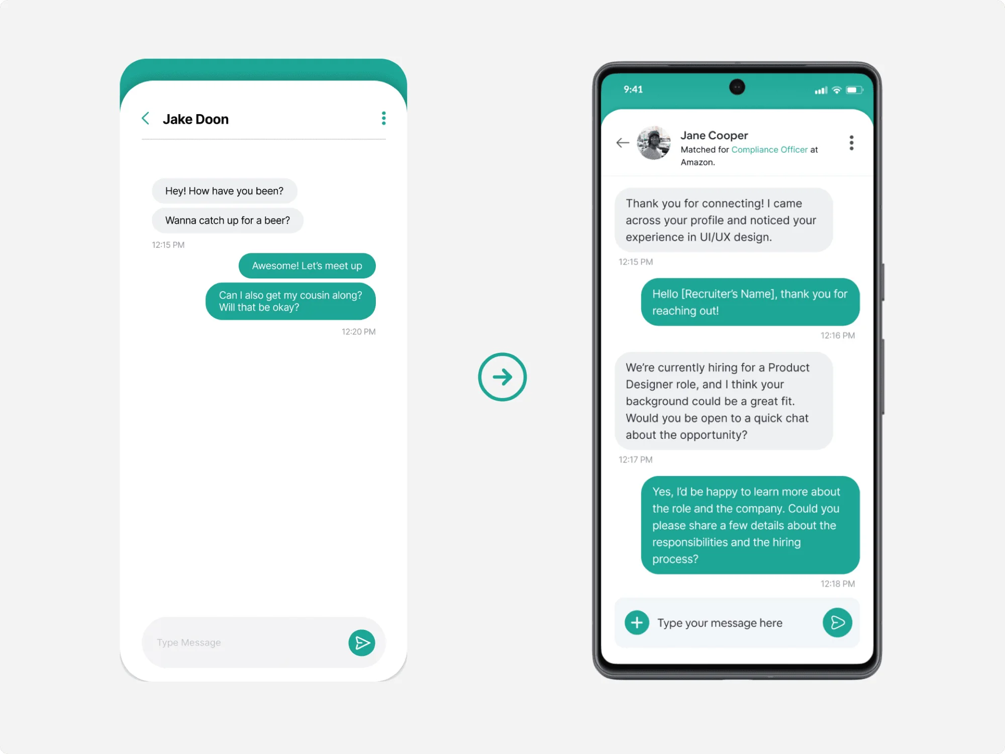
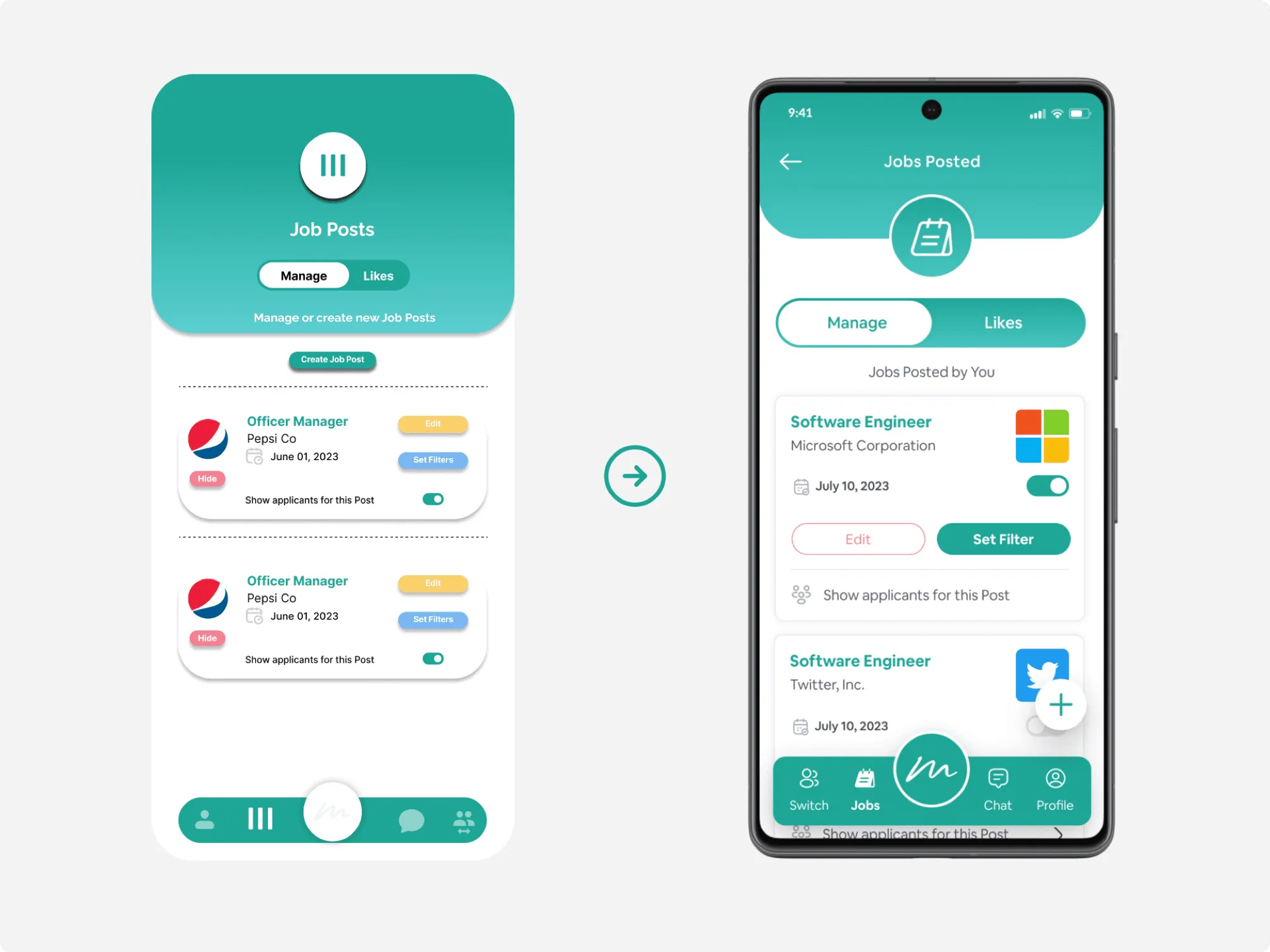
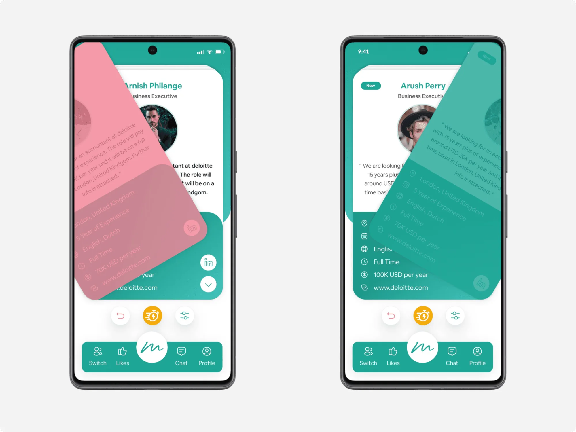
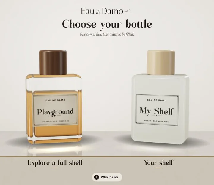
AI project · Live on the web
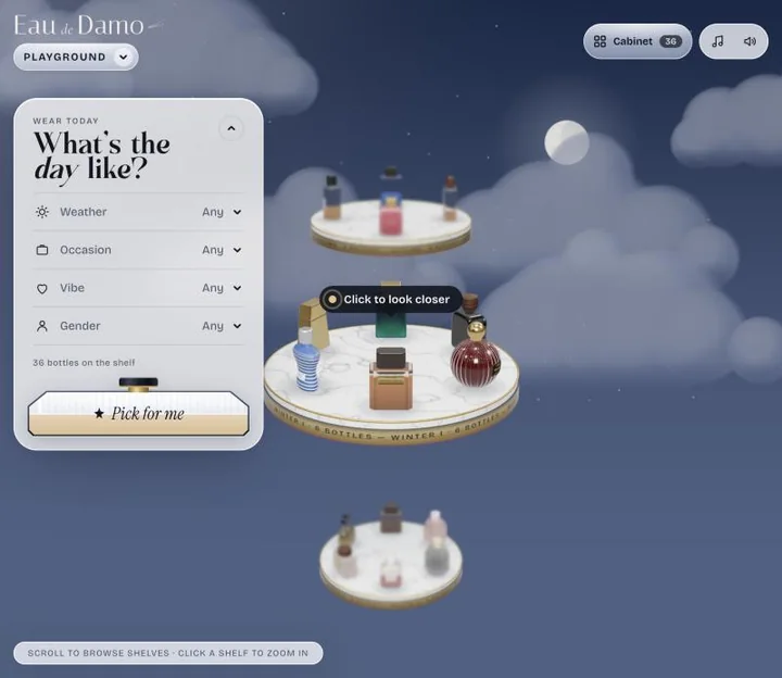
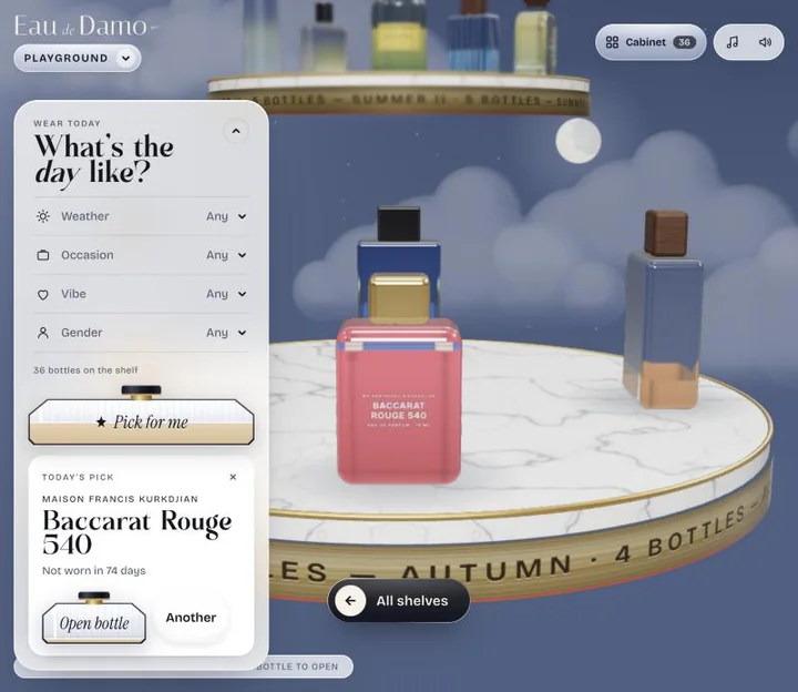
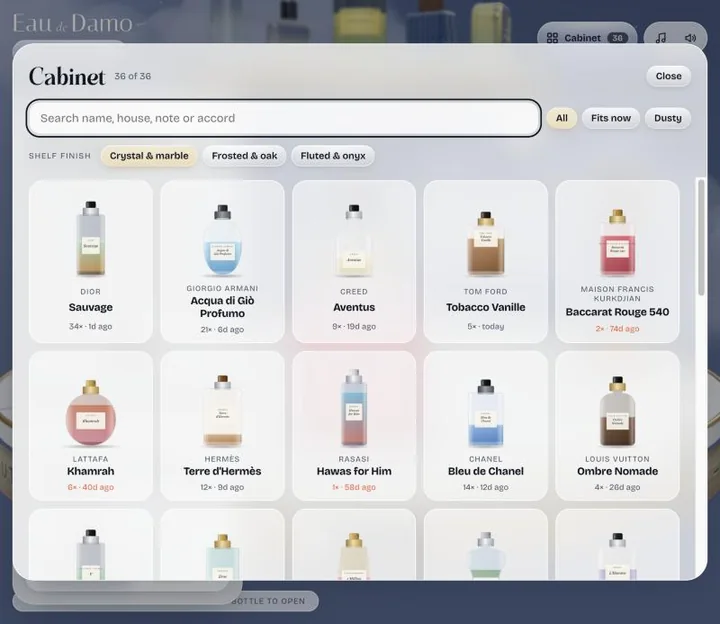
A perfume shelf you can play with: spin the tower, spray a bottle, and get a pick for today’s weather and plans.
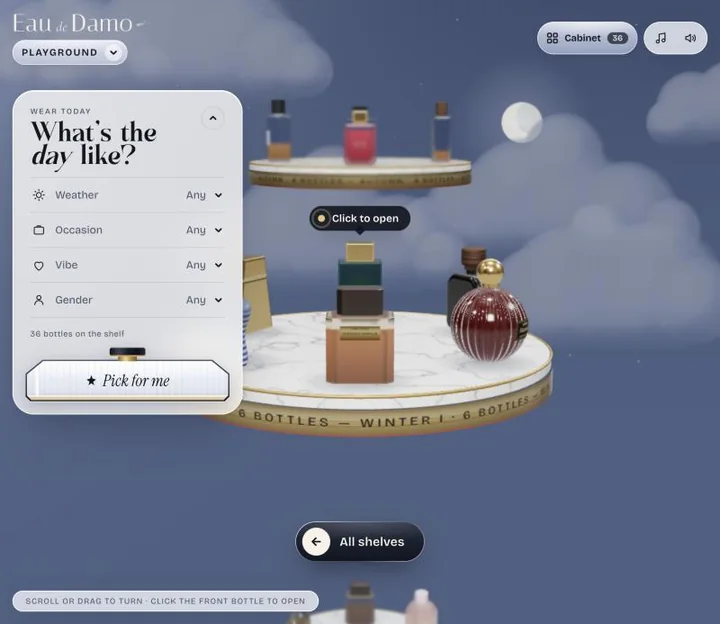
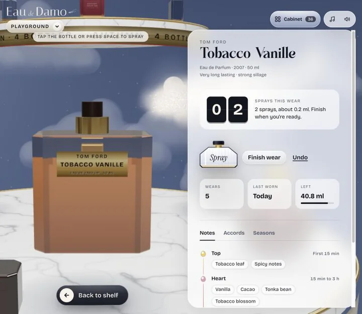
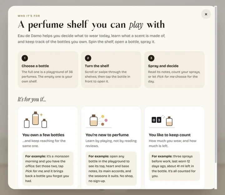
Eau de Damo helps you decide what to wear today, learn what a scent is made of, and keep track of the bottles you own. Spin the shelf, open a bottle, spray it.
I designed it and built it with Claude Code as my coding partner.
01 / 03
One comes full, with 36 perfumes. One waits to be filled with your own.
A 3D tower of seasonal shelves. Drag to turn it, click a bottle to open it.
Spray to count wears. “Pick for me” finds a bottle for today.
02 / 03
and keep reaching for the same one.
Learn by playing, not by reading reviews.
How much you wear, and how much is left.
03 / 03
Plain HTML, CSS and JavaScript with three.js, bundled with esbuild and live on Vercel. No framework, no backend and no account: your shelf is saved only in your own browser. The bottles, caps and labels are drawn in code.
Perfume data from Fragrantica, via the Le Decanteur dataset (CC BY-NC-SA 4.0). The bottles show house names drawn in code, with no brand logos or product photos.