McPloy
Fixing the usability of a swipe-based job app without changing the identity users already knew.
Metafic
McPloy is a swipe-based job and recruitment app with a twist: it works like Tinder, but for finding jobs and hiring people.
The client wanted a better user experience without losing the original “McPloy” look and vibe they had already invested in.
01 / 04
Product Background
Tinder, but for jobs
A swipe-based job app for two kinds of users.
- 01
Pick a role
Job seeker or employer. A switch swaps roles anytime.
- 02
Swipe
Seekers swipe on jobs, employers on candidates.
- 03
Match
Both swipe right, then chat in the app.
- 04
Boost
Buy extra swipes for more chances.
Client’s requirement
Fix the usability without touching the identity.
Keep
- Teal-to-light-green gradients
- Rounded, card-based style
- Same structure and key features
Fix
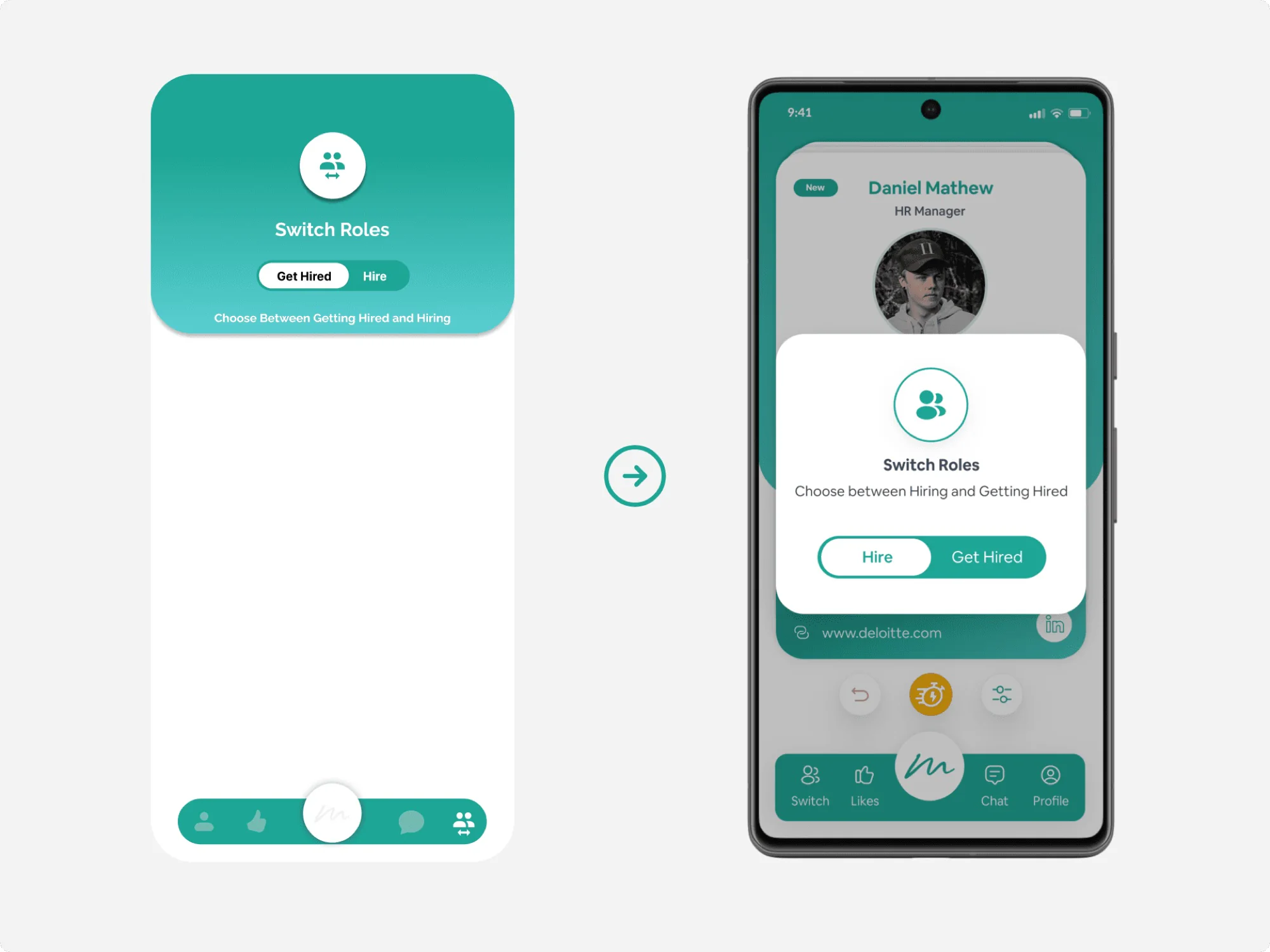
- Clearer navigation, especially switching roles
- Less clutter
- Stronger visual hierarchy
- Boosts people understand
02 / 04
UX Outcomes
40%
fewer mistaps
A Smoother Experience for Users
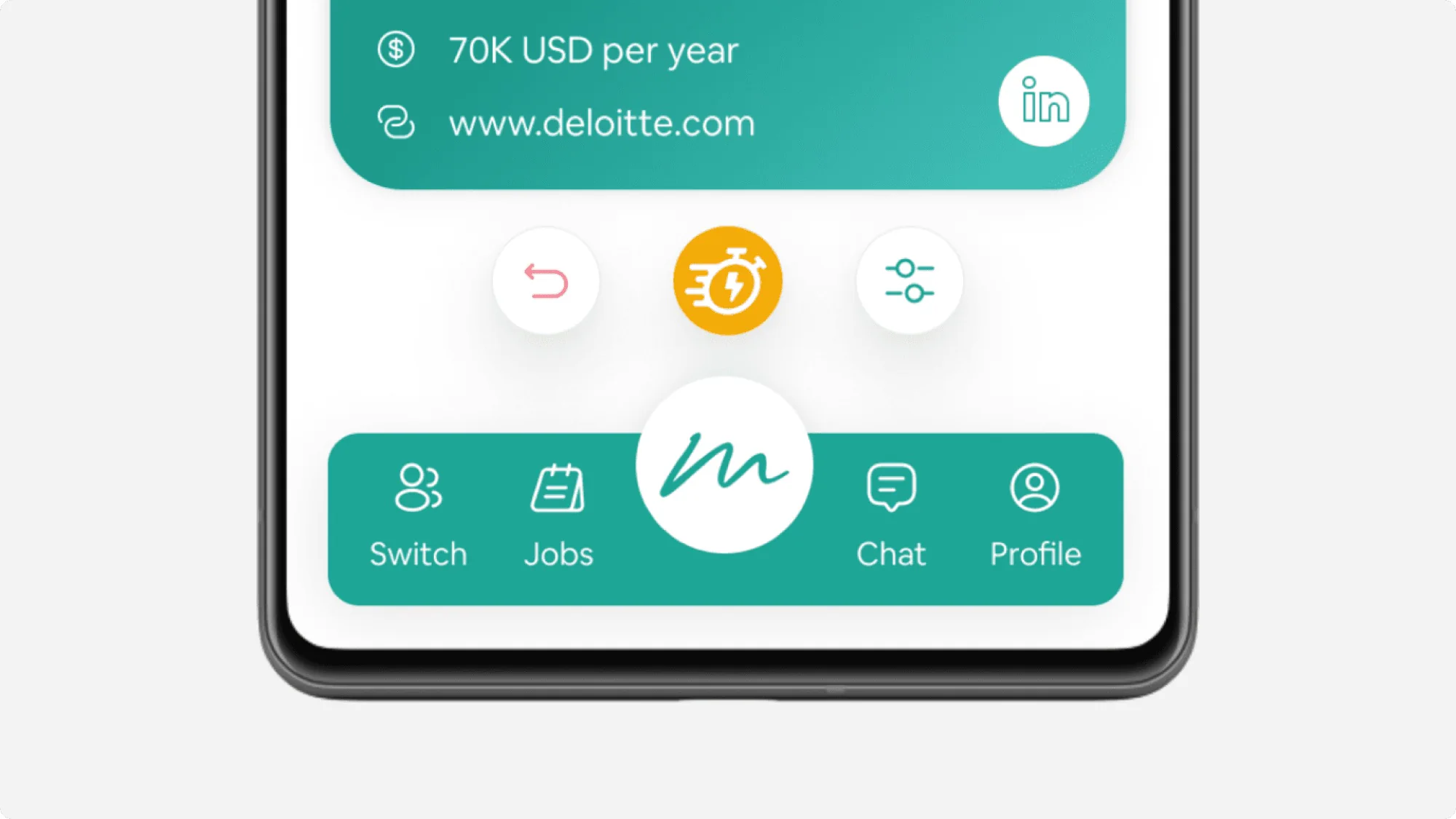
Small, crowded, inconsistent icons caused frequent misclicks.
- Larger tap areas
- One icon style
- More space between taps
+1.7
user satisfaction rating
From “OK (2.5)” to “Great (4.2)”
The usability score (SUS) jumped after the redesign.
- Clear role indicators
- Less clutter, same brand
- Prioritised CTAs
18%
more boost purchases
Boosts People Actually Notice
Boosts were hidden and never explained their value.
- Prompt at the swipe limit
- One-tap purchase from the swipe screen
03 / 04
Research
Stakeholder interviews
The design language had to stay, so I started with the people who run the product.
I asked
- What’s the main success metric?
- Which parts of the UI get the most complaints?
- Which features must stay untouched?
I learned
- Grow paid boosts and subscriptions without feeling pushy
- The swipe is non-negotiable: it is the brand
- Navigation and accidental taps are the top complaints
Usability testing on the existing app
8 participants, 4 tasks each.
- 01
Switch to employer mode
- 02
Swipe through 5 profiles
- 03
Match and start a chat
- 04
Check swipe limits and upgrade
60%
Couldn’t find role-switch
within 10 seconds
70%
Of first-time users
said the icons felt “confusing” or “too similar”
25%
More frustration
reported when switching between modes
8
Participants
4 job seekers, 4 employers
Heuristic evaluation (Nielsen’s 10)
- 01
Visibility of system status
No feedback on swipe limits.
- 02
Consistency and standards
Inconsistent icon styles.
- 03
Recognition over recall
Role-switch lacked clear indicators.
- 04
Aesthetic & minimalist design
Inconsistent spacing, colourful and stretched icons.
04 / 04
Final Designs
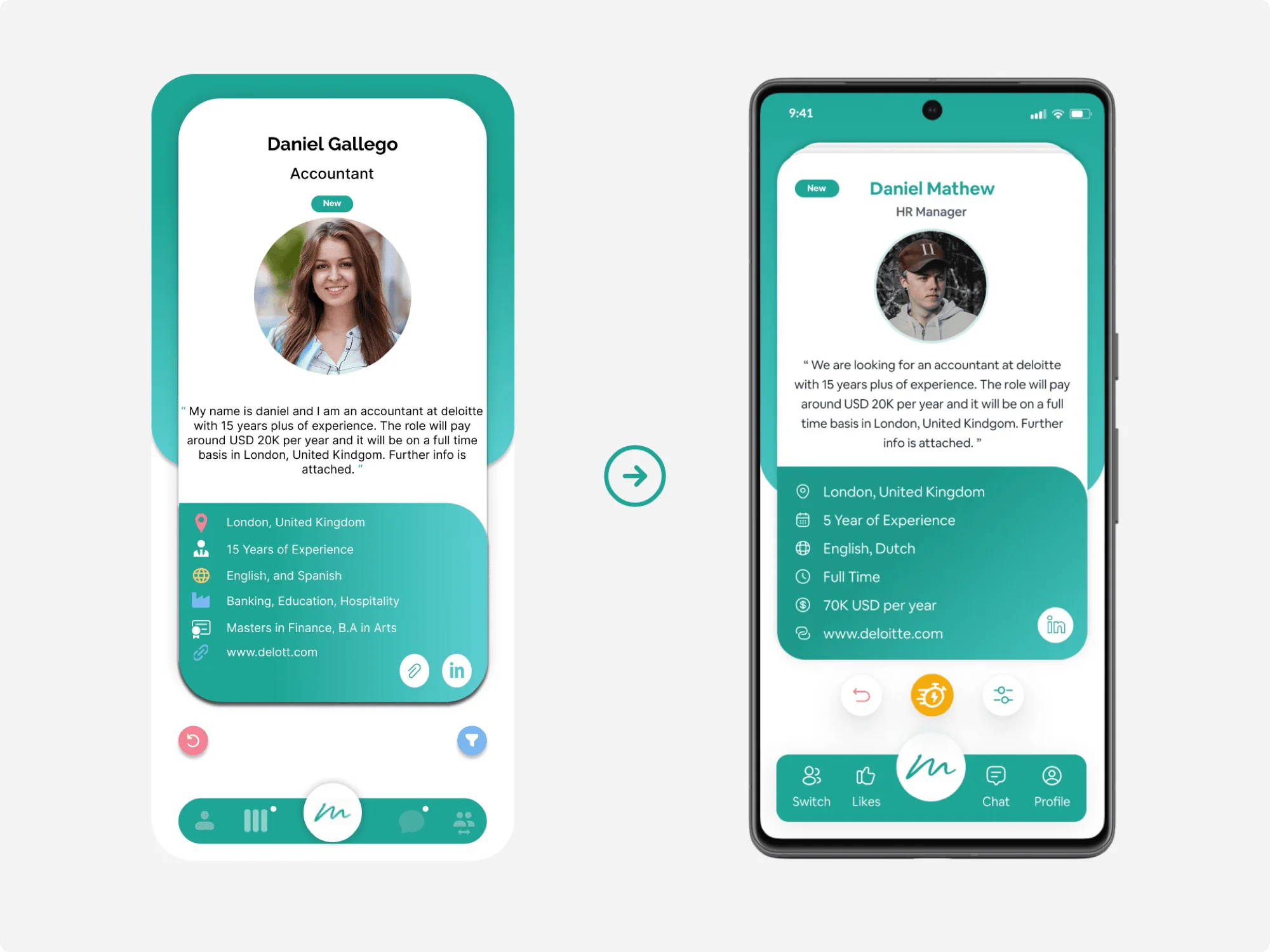
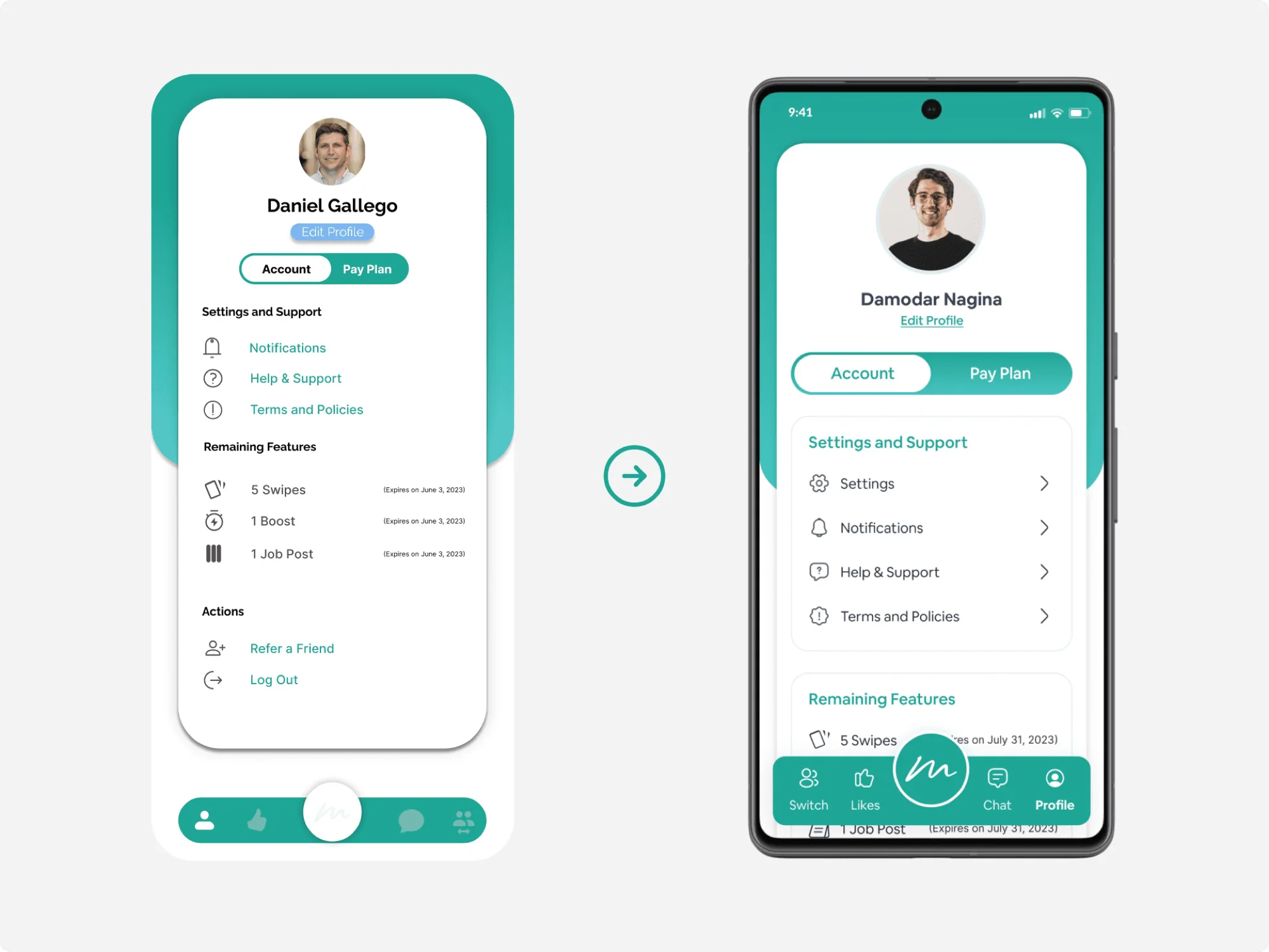
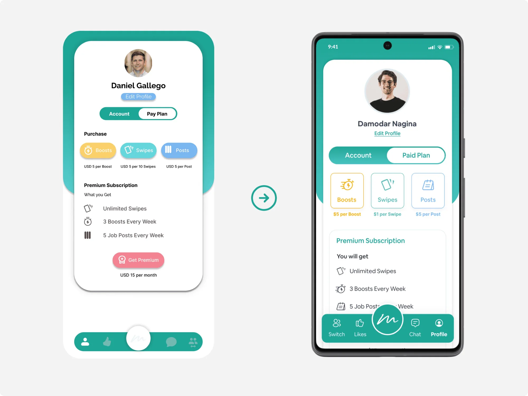
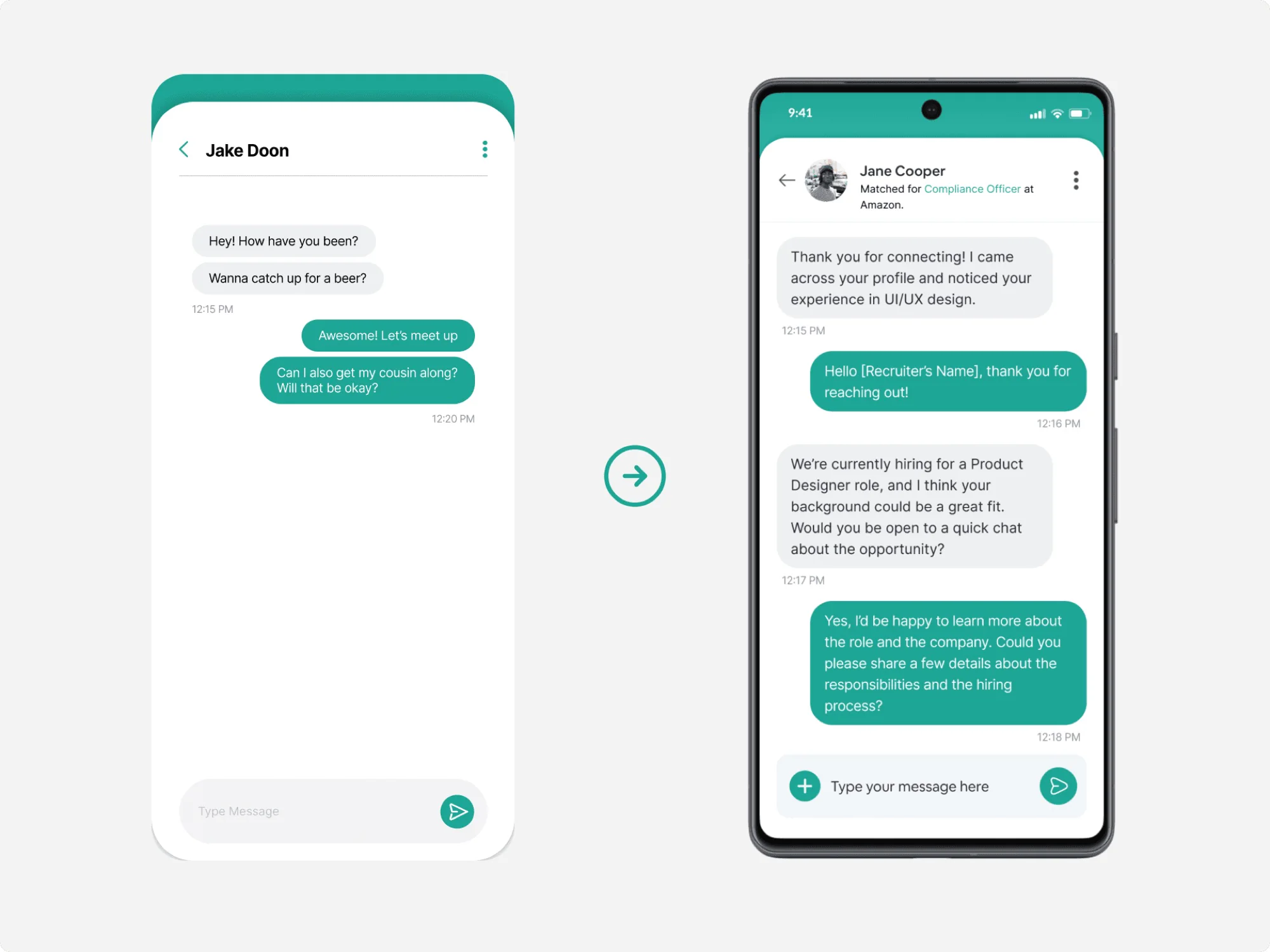
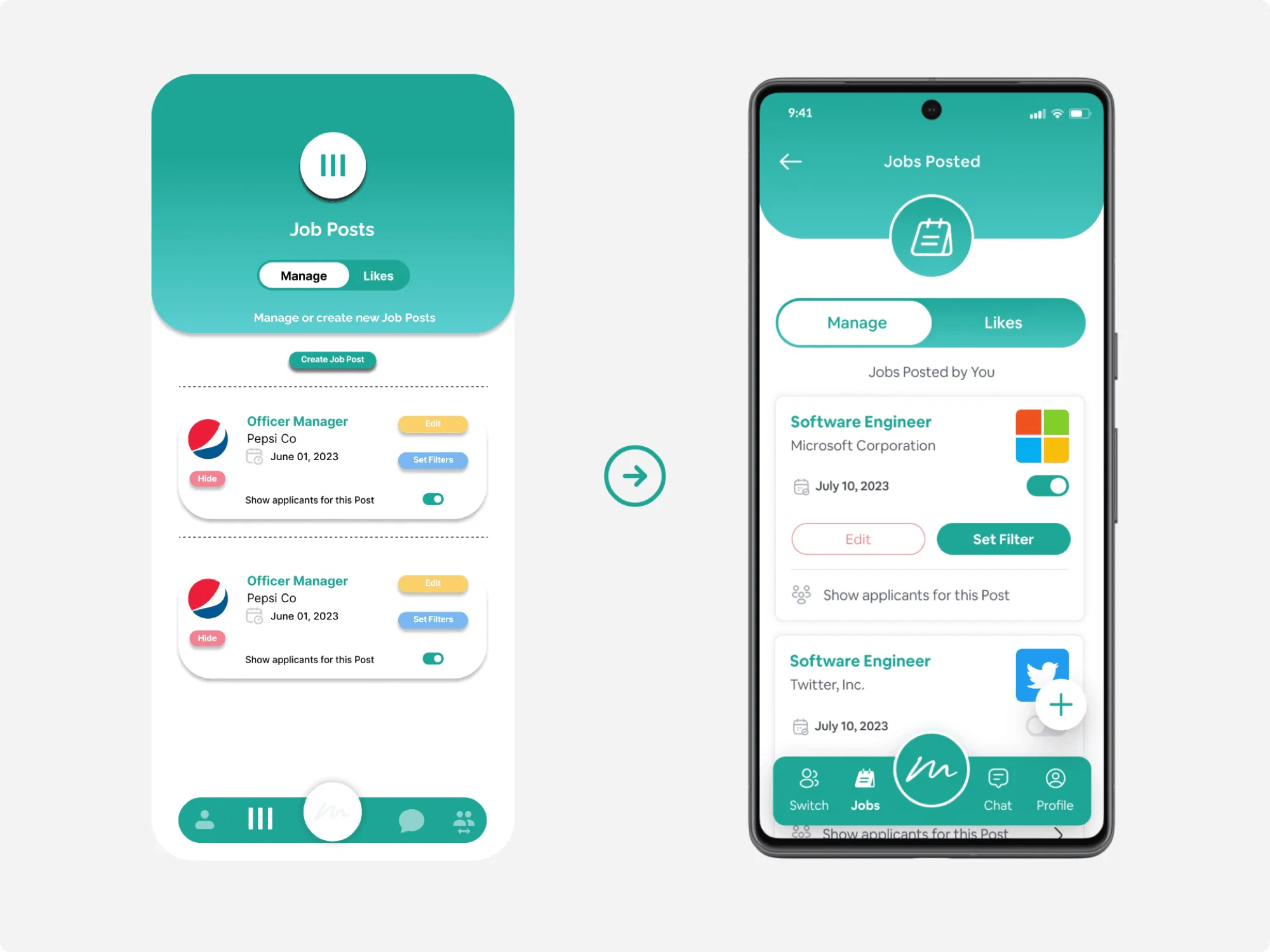
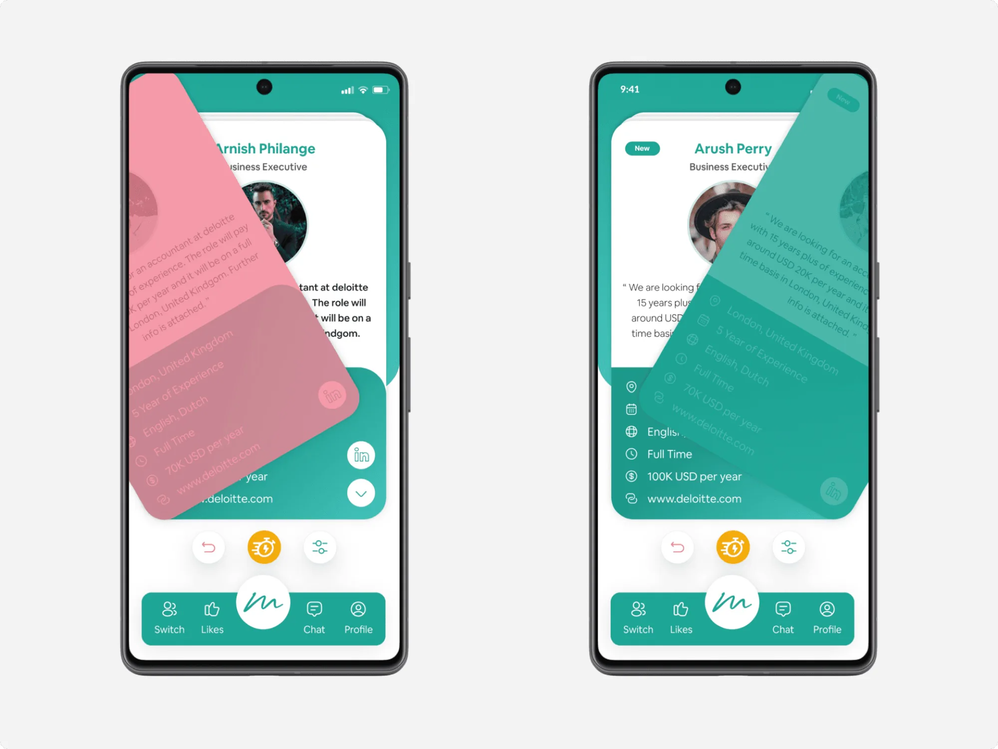
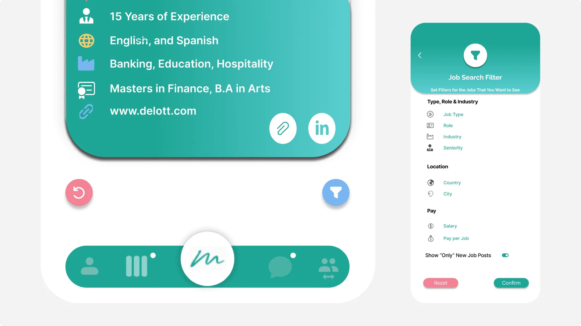
Before & after screens